
The Antidote to Financial Hype
Stay on Top of
Financial Markets.
Our mission is to make financial markets accessible through easy-to-use charts, empowering you to spot trends and stay informed.
Tools & reports
Flagship tools.
Weekly Macro Report
Stay ahead by spotting key market signals. Discover long-term trends with our weekly report's AI-powered analysis of macroeconomic data and global financial markets.
The Macro Compass
The Macro Compass helps investors navigate economic cycles. It identifies regimes (Goldilocks, Stagflation, Deflation), analyzes historical asset performance, and backtests dynamic strategies.

Investment Co-Pilot
An AI-powered tool built on the Simple, Cheap, Safe, and Easy philosophy from John Y. Campbell's research. Build a custom Investment Policy Statement (IPS) tailored to your life.

FIRE Agent (Retire Early)
Achieve Financial Independence and Retire Early with confidence. Plan your personalized path using Bill Bengen's updated 4.7% Rule research with full transparency.
Chart catalog
All charts.
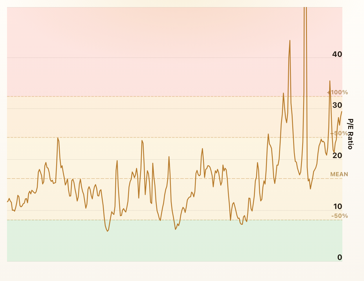
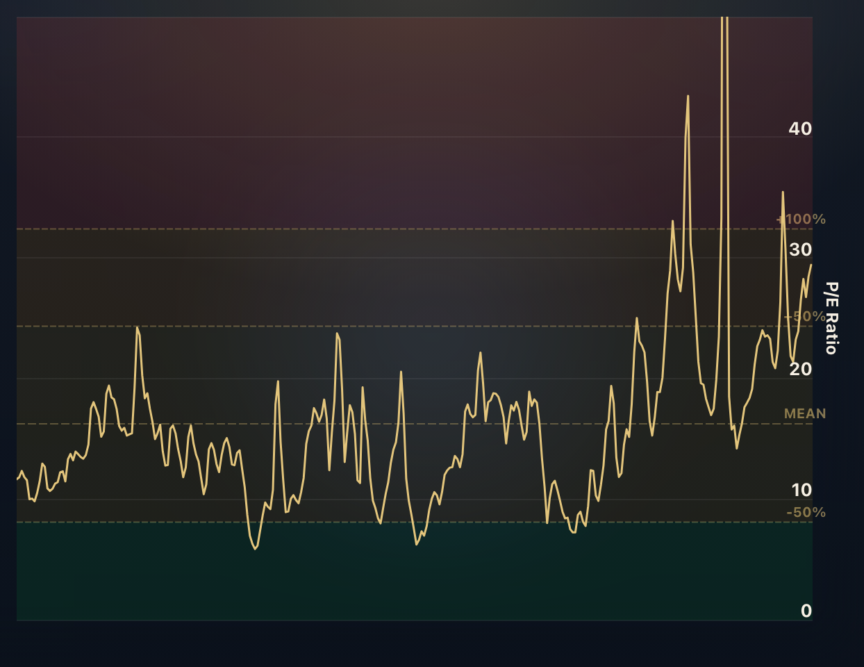
S&P 500 PE Ratio - Shiller PE Ratio
The price earnings ratio is calculated by dividing a company's stock price by its earnings per share. It is one of the most widely-used valuation metrics for stocks.
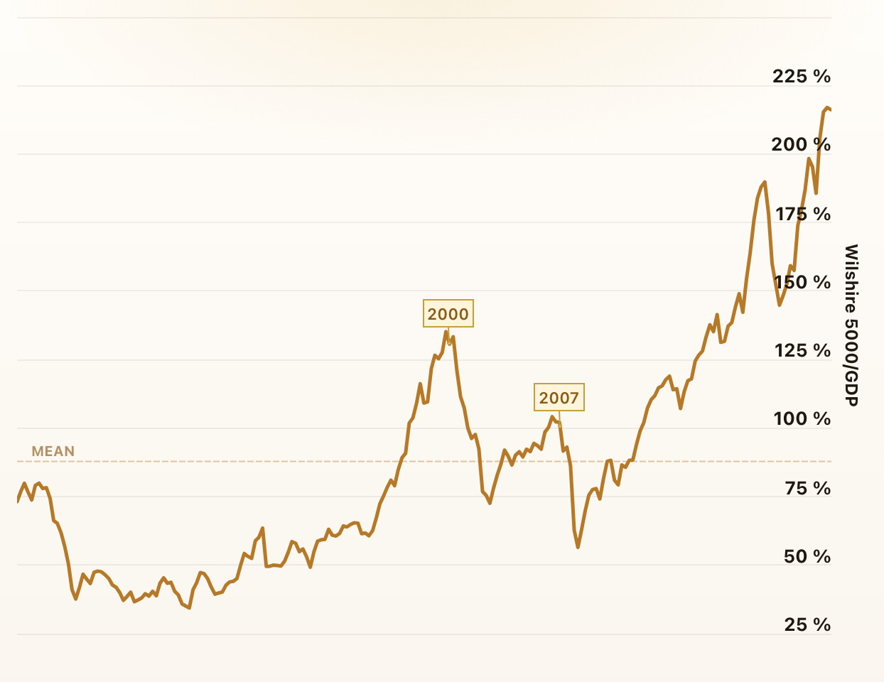
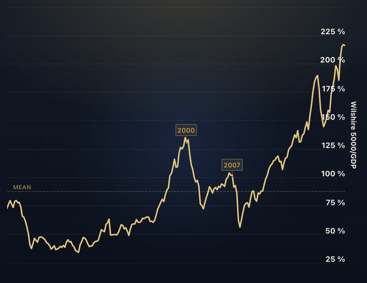
The Buffett Indicator: Market Cap to GDP
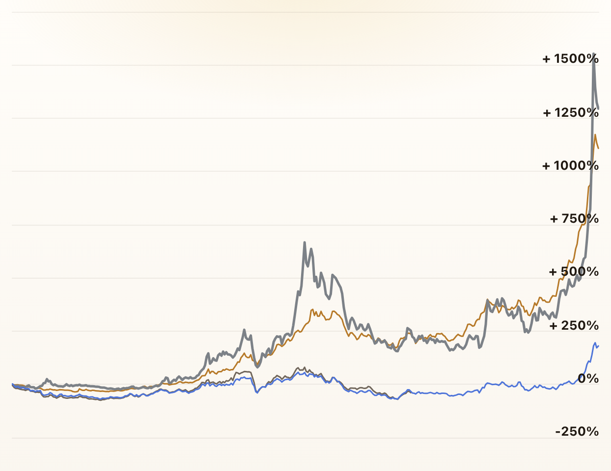
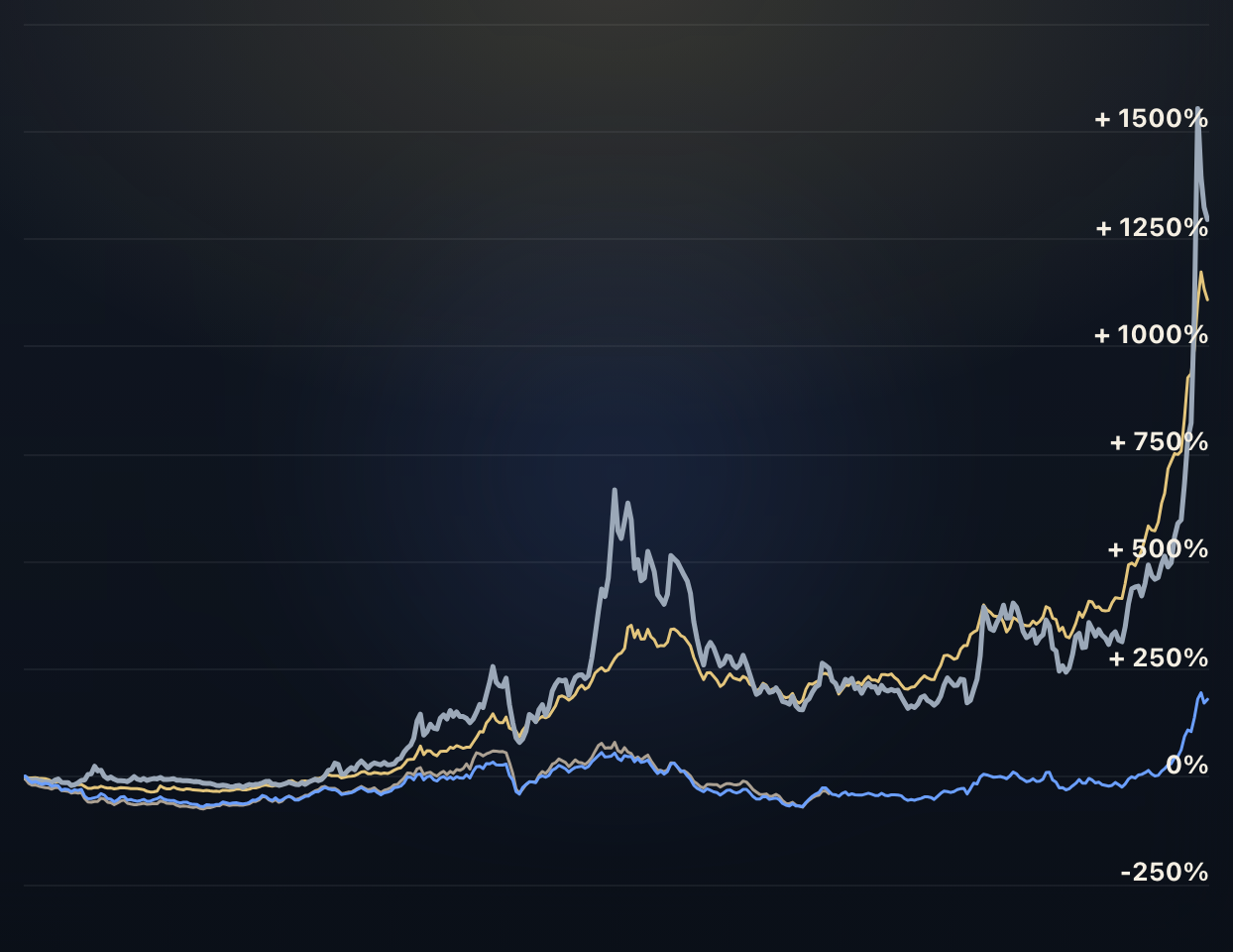
Which was the best investment in the past 30, 50, 80, or 100 years? This chart compares the performance of the S&P 500, the Dow Jones, Gold, and Silver.
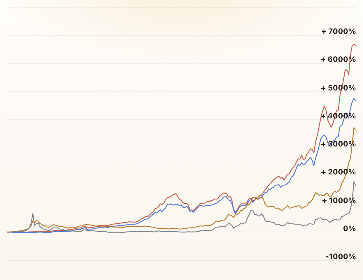
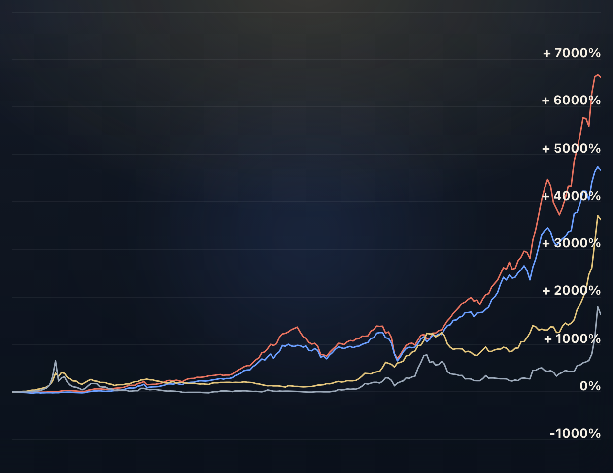
Stocks vs. Gold and Silver
Compare long-run performance leadership across equities and precious metals.

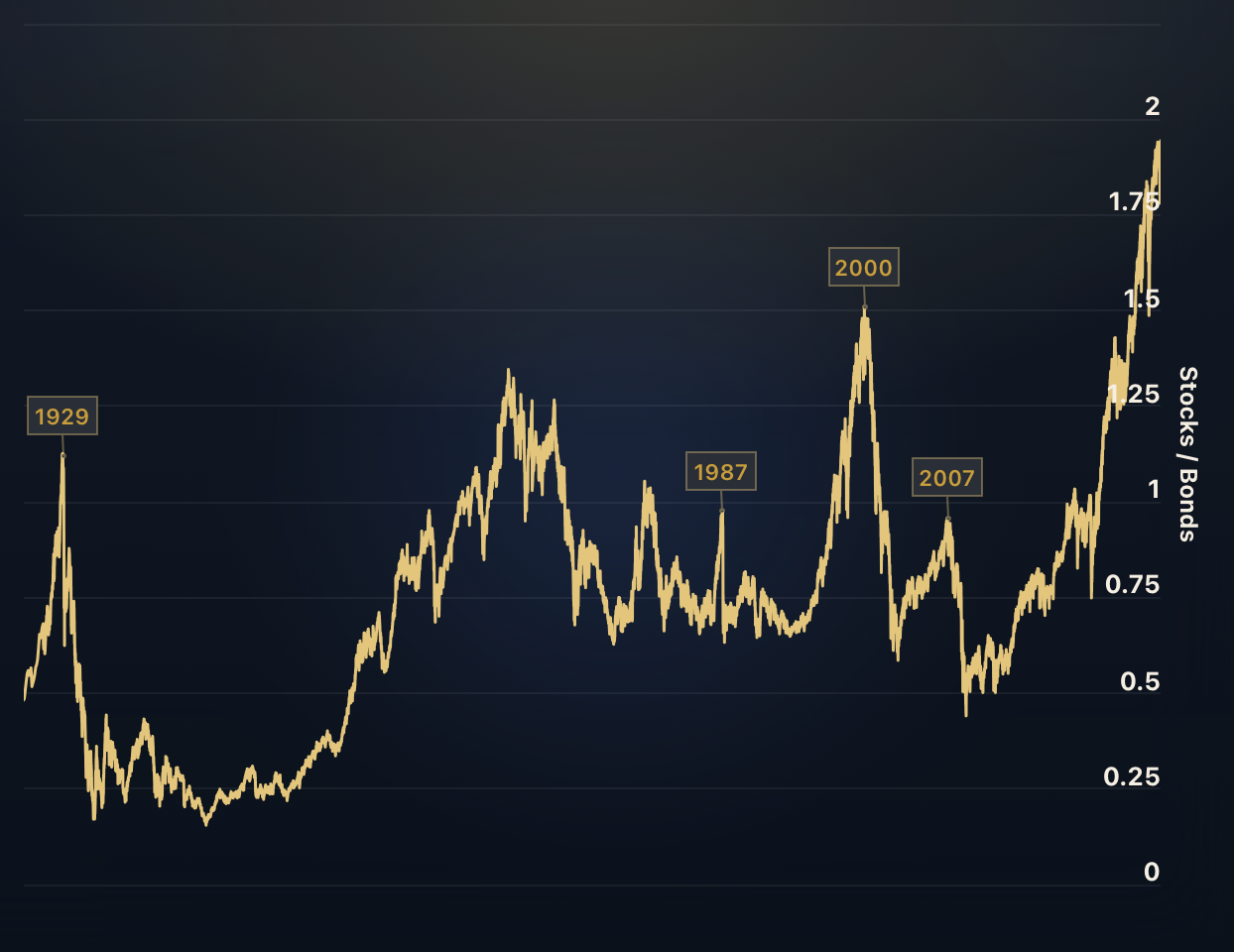
Stocks vs. Bonds
Which performed better in the past, Stocks or Bonds? The ratio in this chart divides the S&P 500 by a Total Return Bond Index. When the ratio rises, stocks beat bonds - and when it falls, bonds beat stocks.
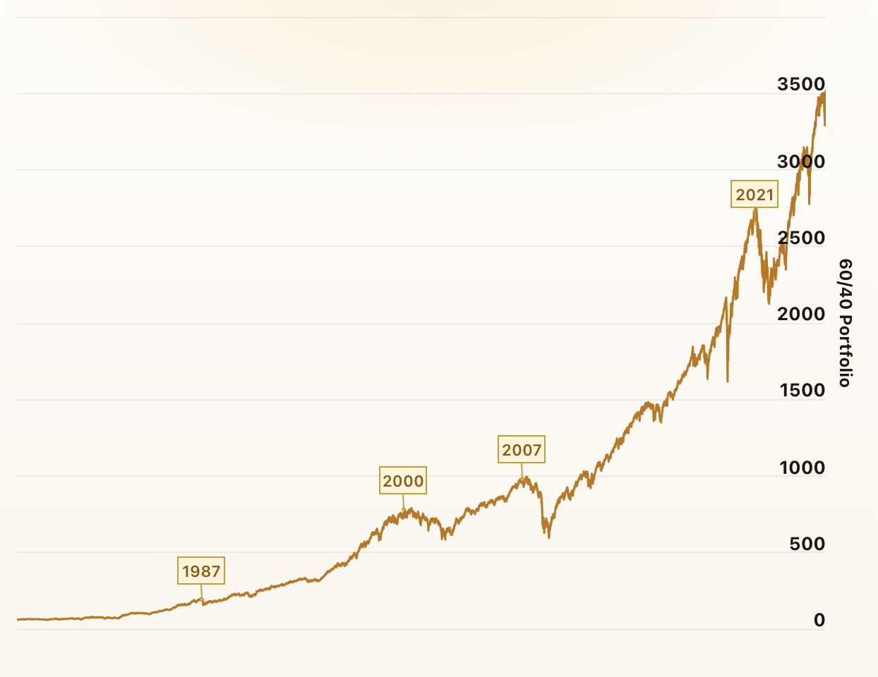
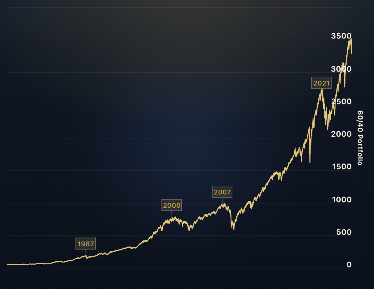
The 60/40 Portfolio
The 60/40 portfolio is an investment strategy that allocates 60% of assets to stocks and 40% to bonds. Over time, it has been recognized for its simplicity, effectiveness, and historical performance.
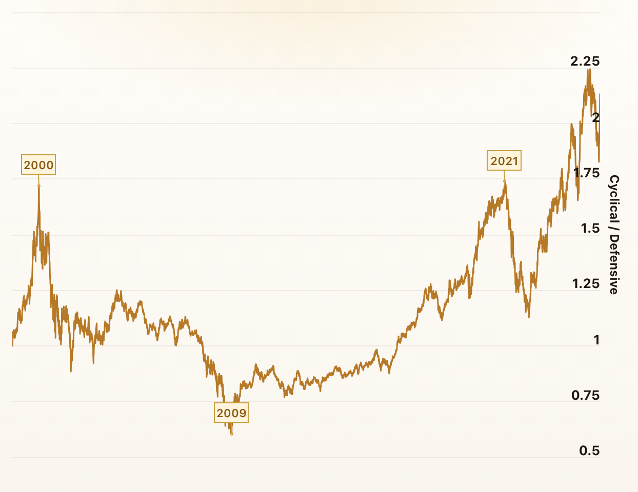
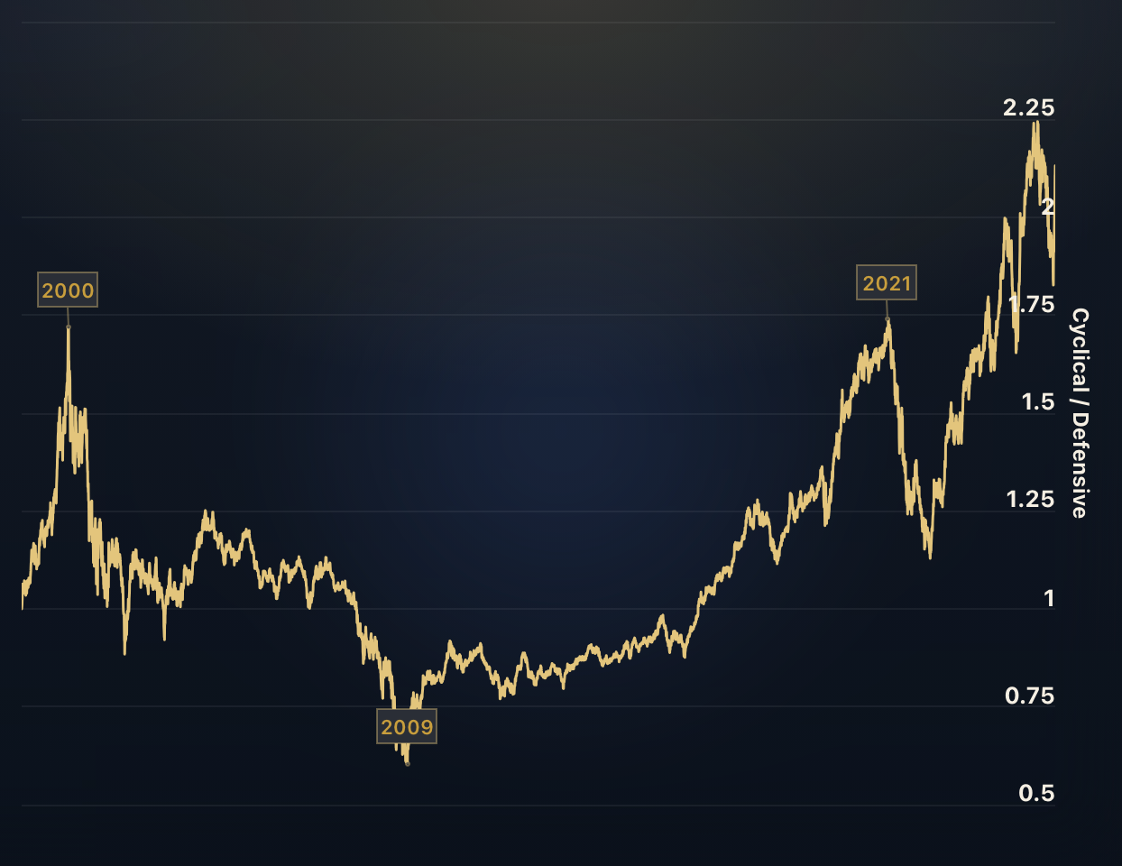
Cyclical vs. Defensive Sectors
The ratio acts as a barometer of market sentiment and economic outlook. It mirrors investors' changing preferences, oscillating between seeking growth in cyclical sectors and desiring stability in defensive sectors.
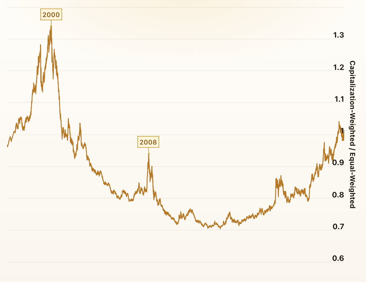
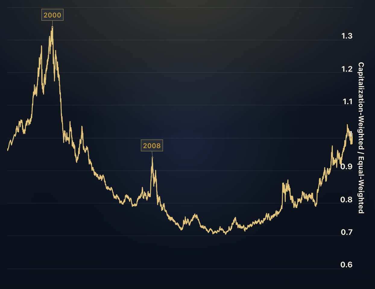
Market-cap Weight vs. Equal Weight
A rising ratio indicates that larger companies are outperforming the broader market. In contrast, a falling ratio suggests that smaller companies are performing better relative to larger ones.
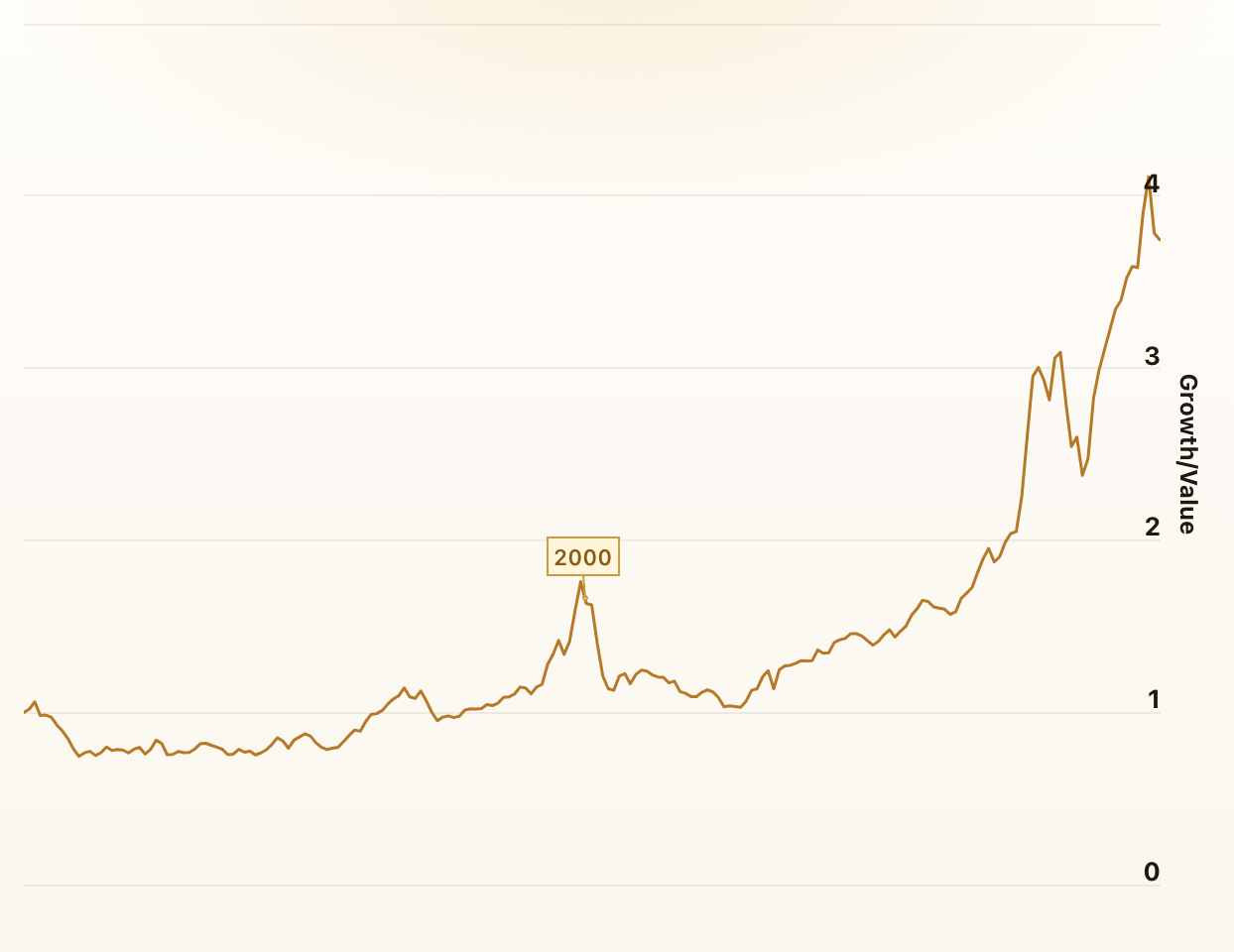
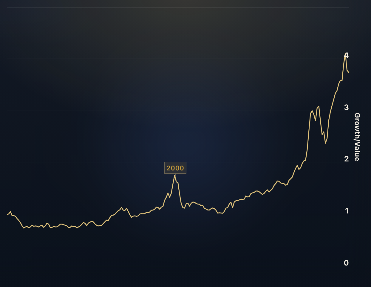
Growth vs. Value Stocks
Which performed better in recent years, growth stocks or value stocks? When the ratio rises, growth stocks outperform value stocks - and when it falls, value stocks outperform growth stocks.
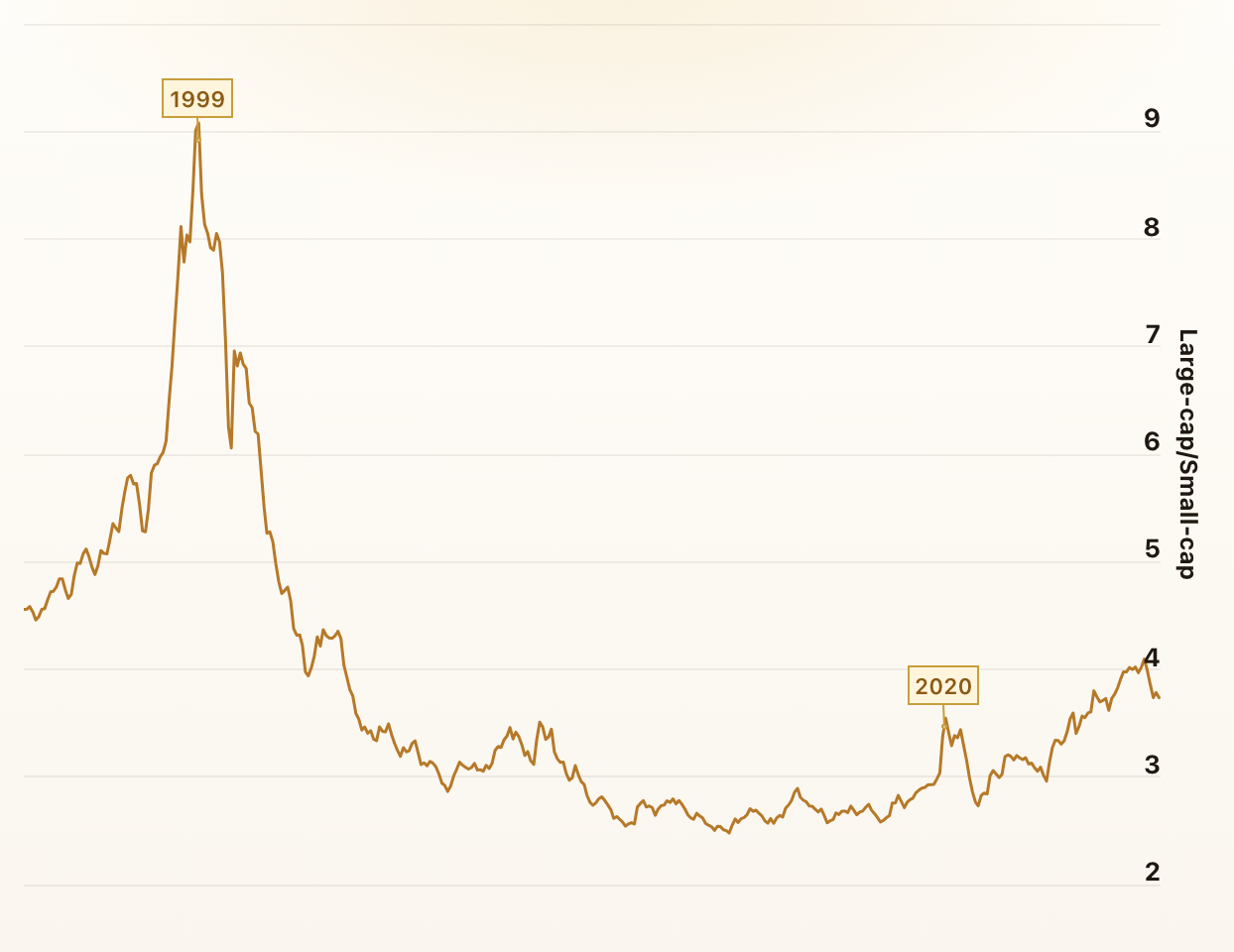
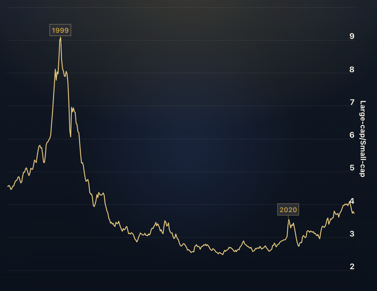
Large-cap vs. Small-cap Stocks
Which performed better in recent years, large-cap or small-cap stocks? When the ratio rises, large-cap stocks outperform small-cap stocks - and when it falls, small-cap stocks outperform large-cap stocks.
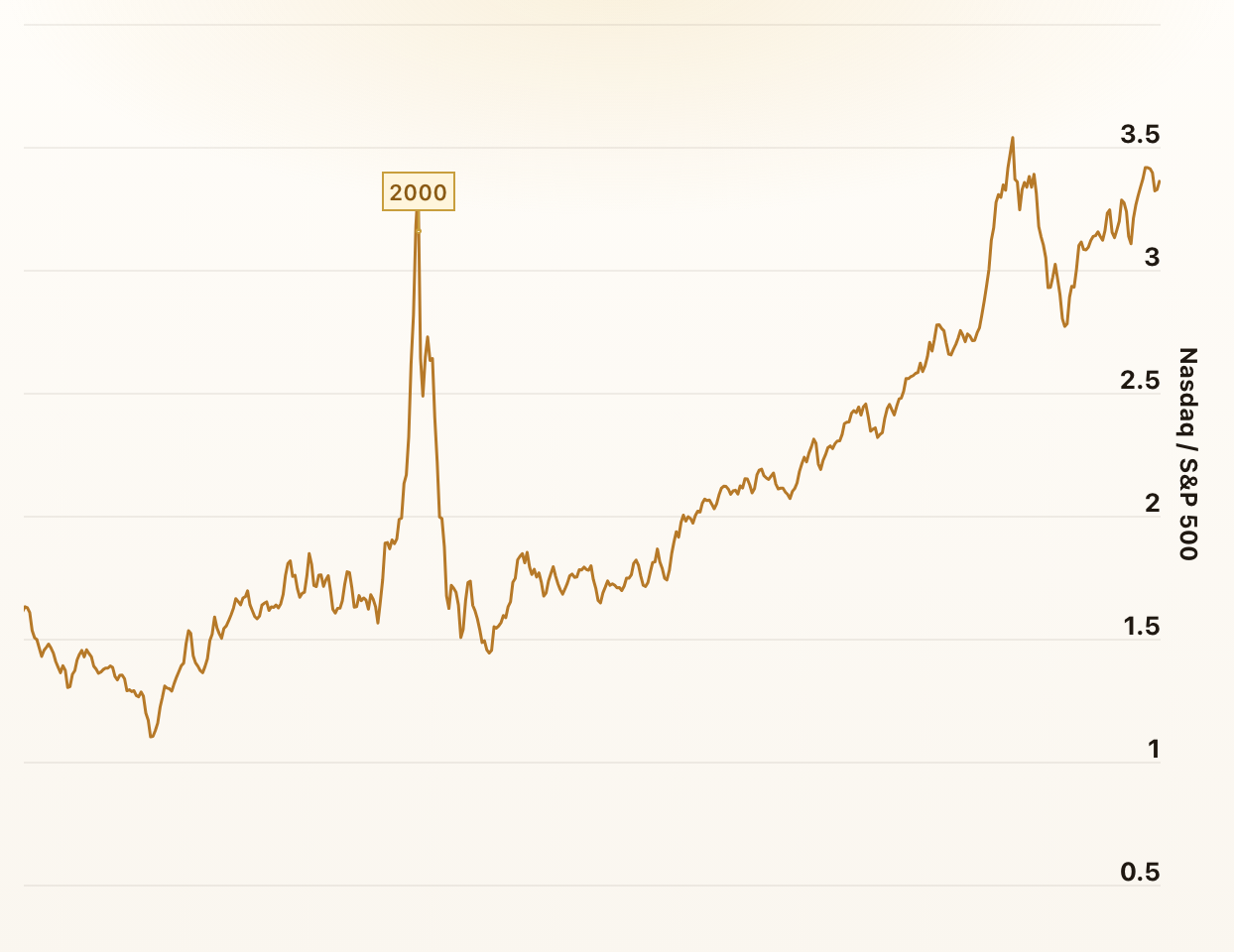
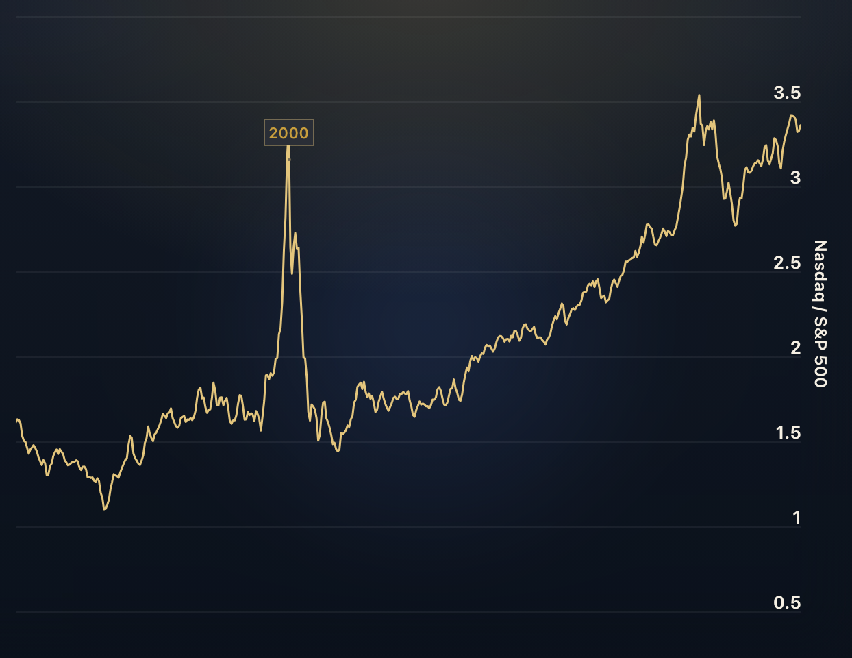
Nasdaq to S&P 500 Ratio
The Nasdaq to S&P 500 ratio compares the performance of the Nasdaq Composite Index, which primarily consists of technology and growth-oriented companies, to the broader U.S. stock market represented by the S&P 500.
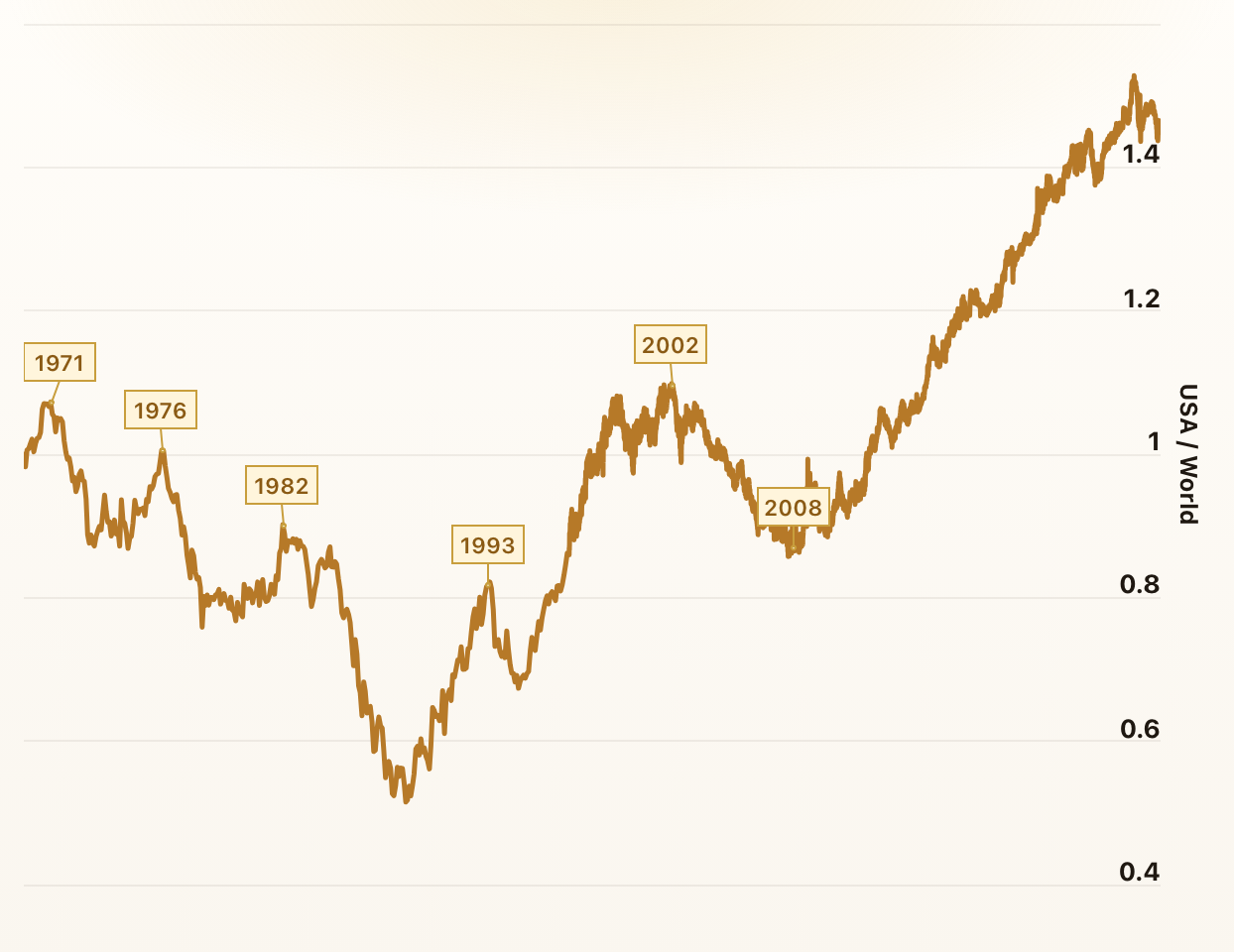
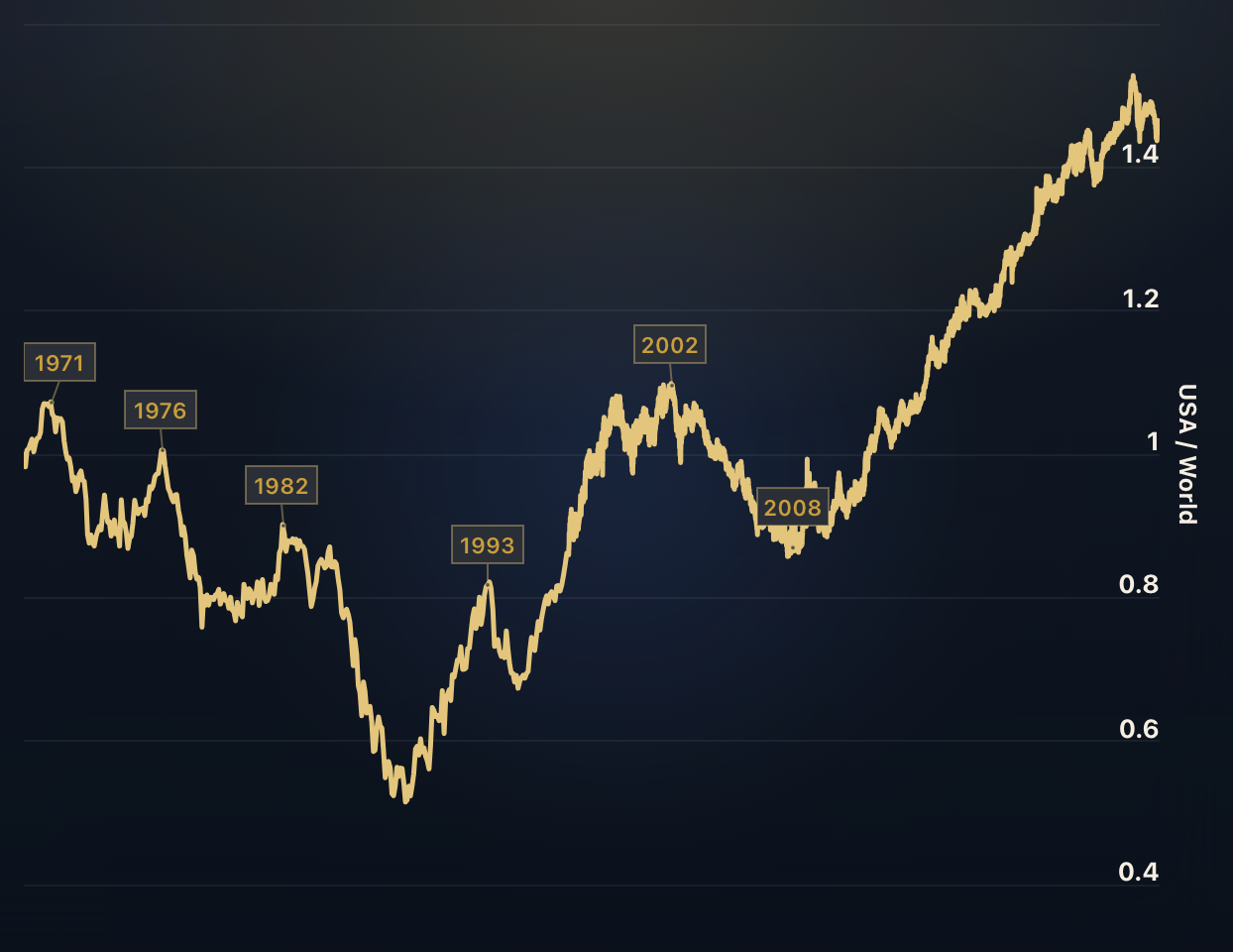
US Stocks vs. The World
What is the proportion of the US stock market to the global stock market? By definition, this ratio cannot grow forever. At some point, US stocks would simply make up 100% of global stocks.
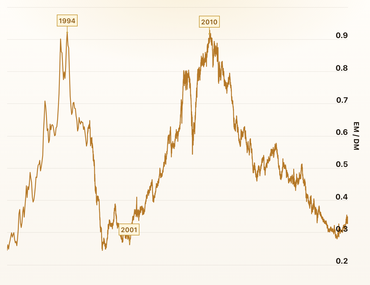
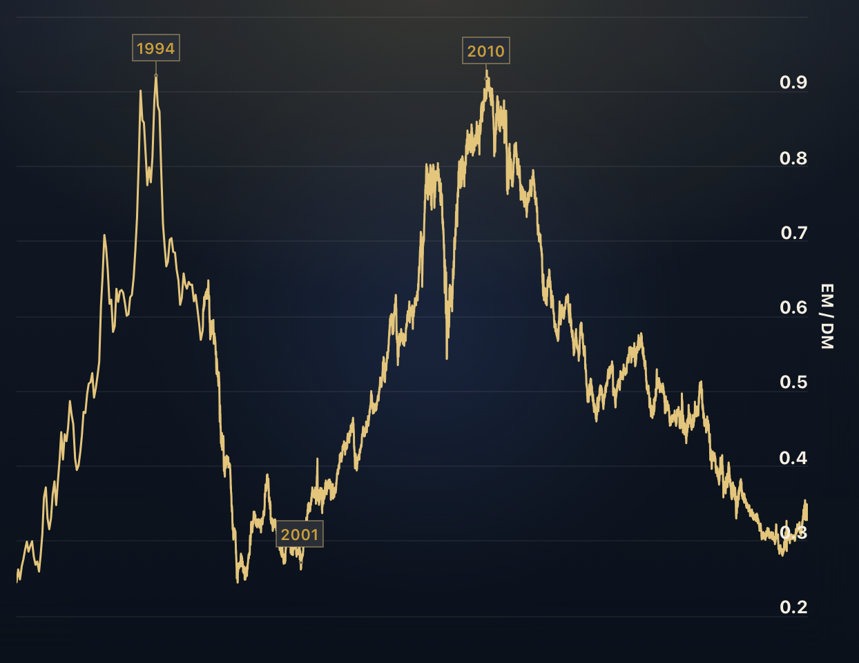
Emerging vs. Developed Markets
Which performed better in recent years, emerging or developed market equities? The ratio in this chart divides the MSCI Emerging Markets Index by the MSCI World Index.
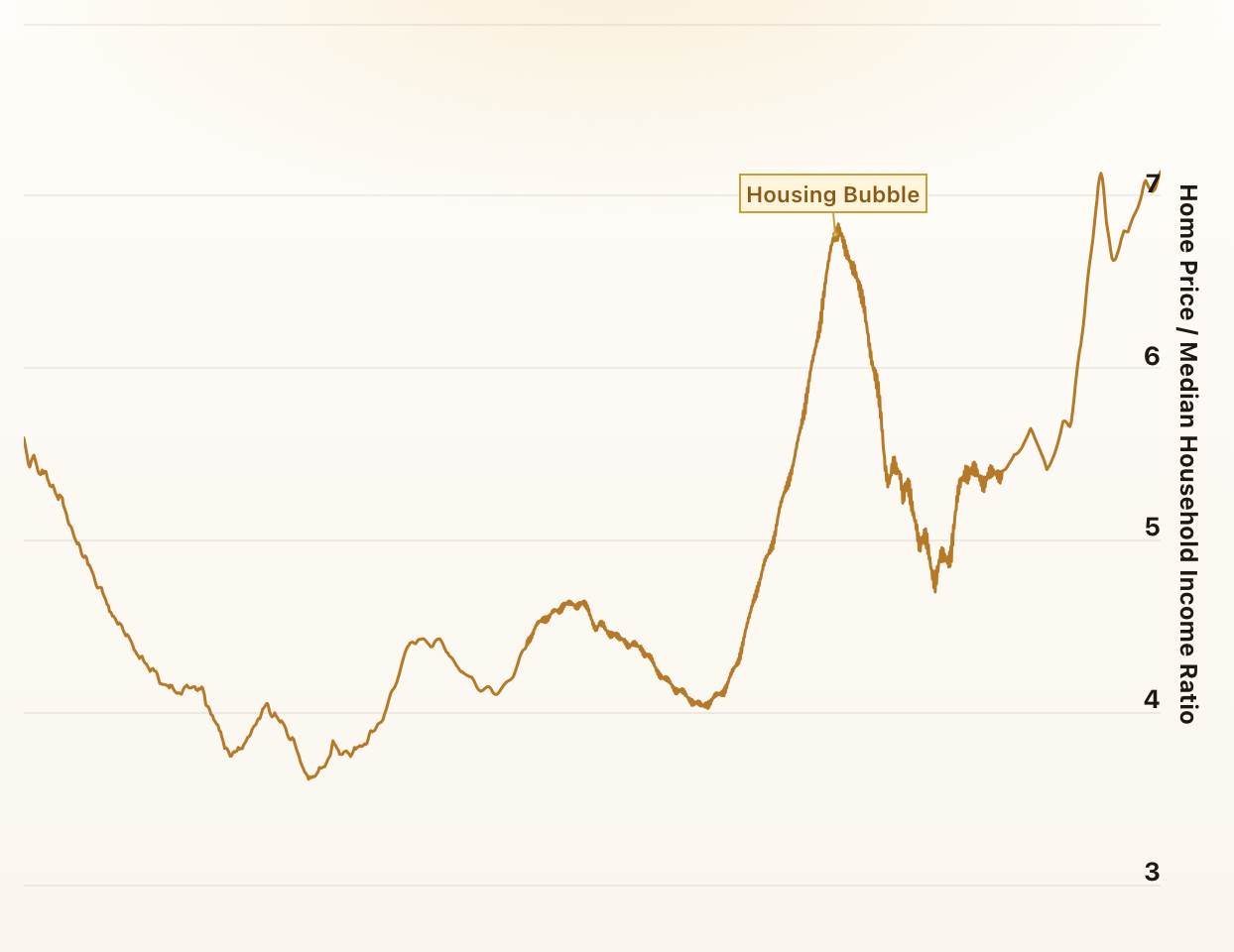
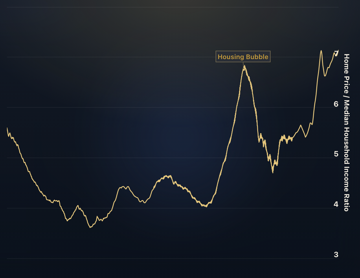
Home Price to Income Ratio
Historically, an average house in the US cost around 5 times the yearly household income. The ratio in this chart divides the Case-Shiller Home Price Index by the US median annual household income.
The Real Home Price
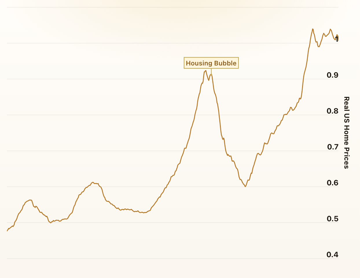
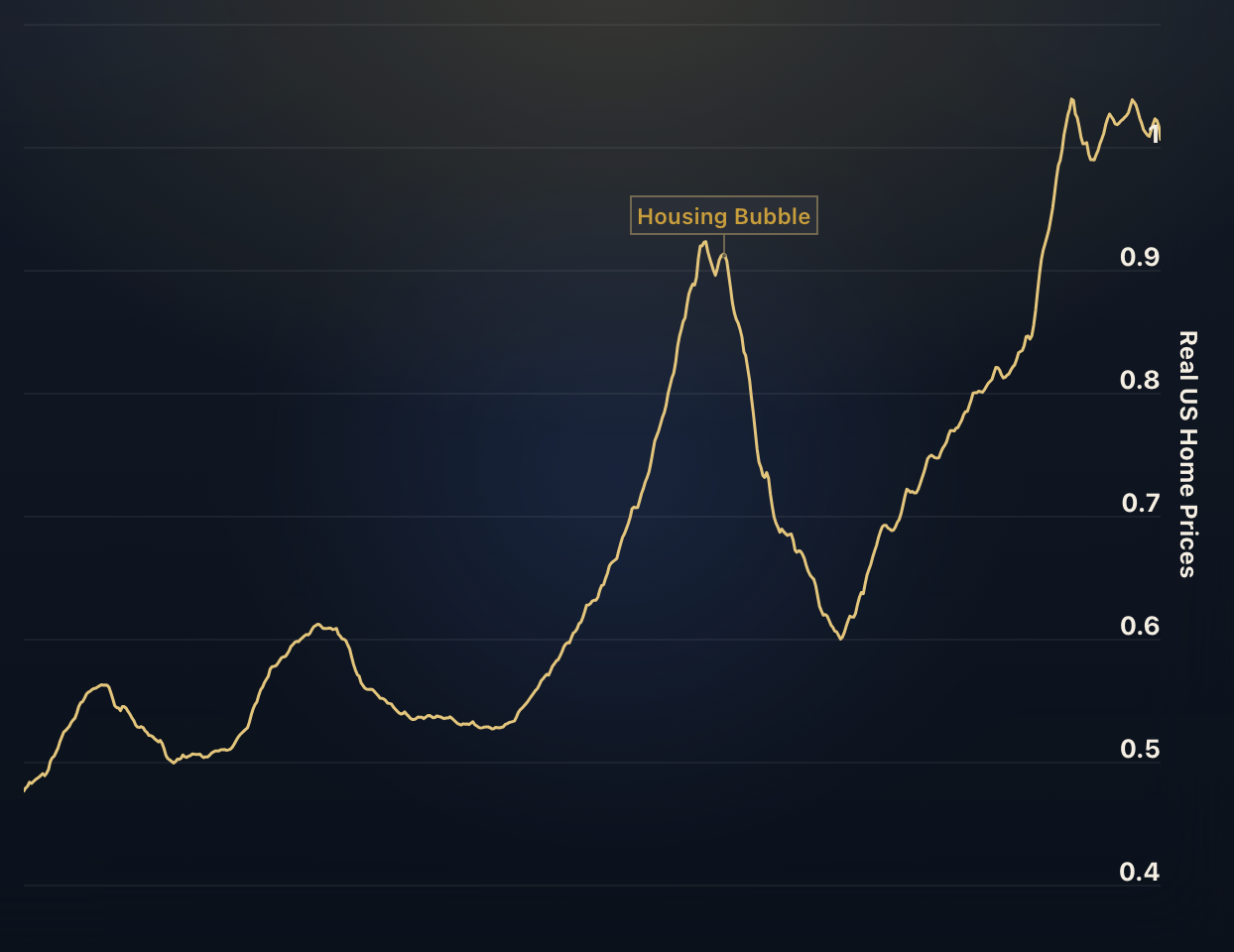
The ratios in these charts divide the nominal home price by the Consumer Price Index (CPI) and therefore display the real home price over time.
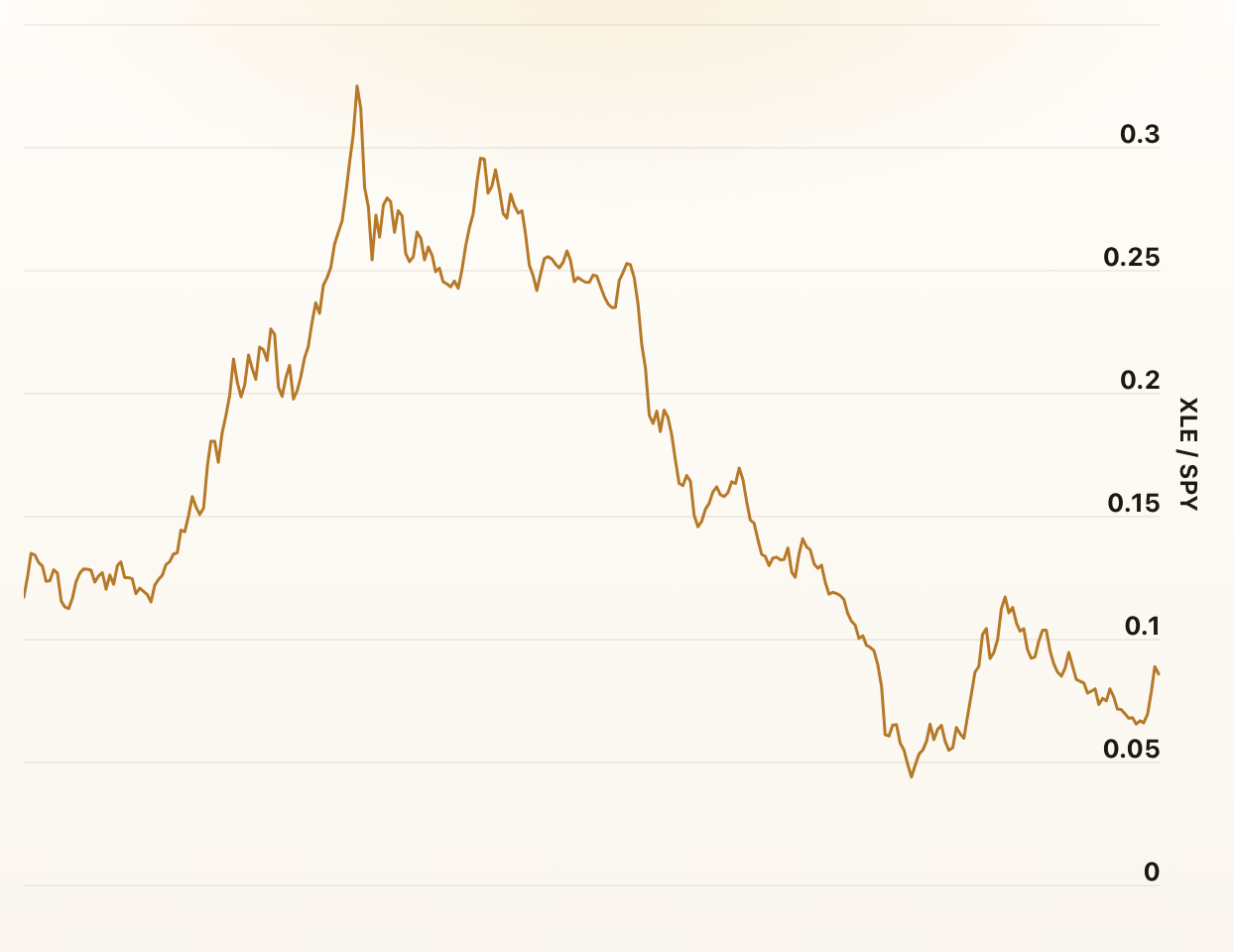
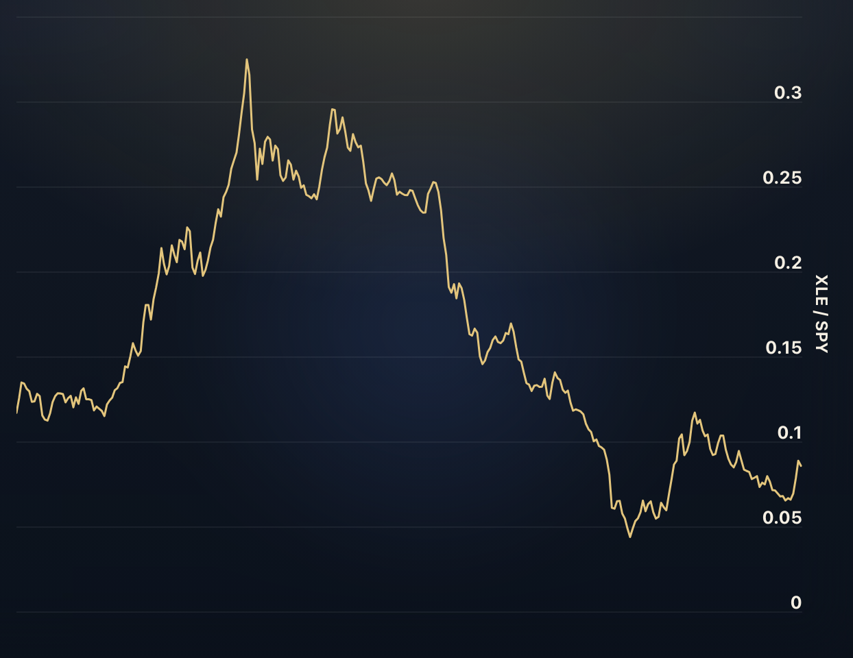
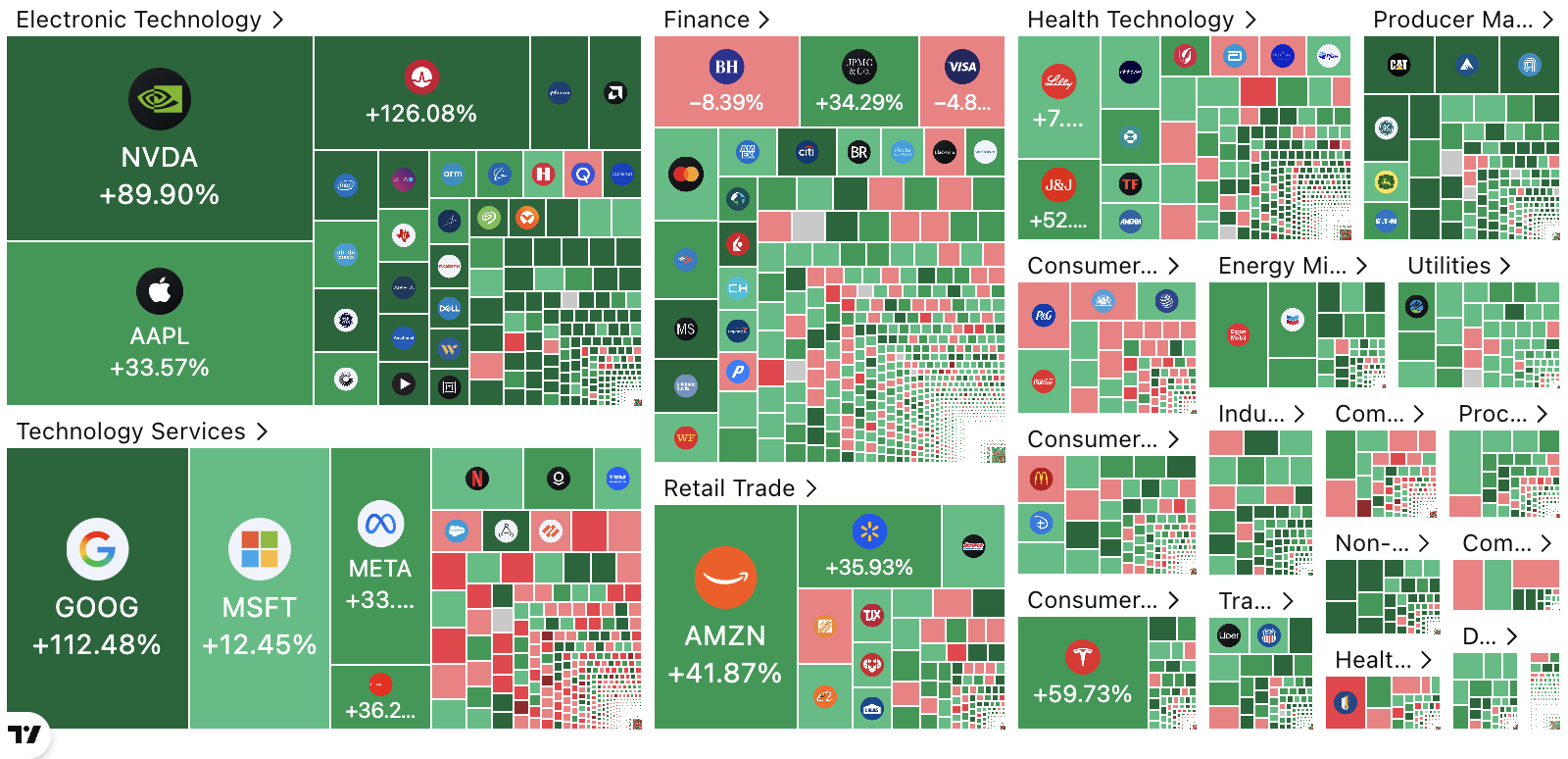
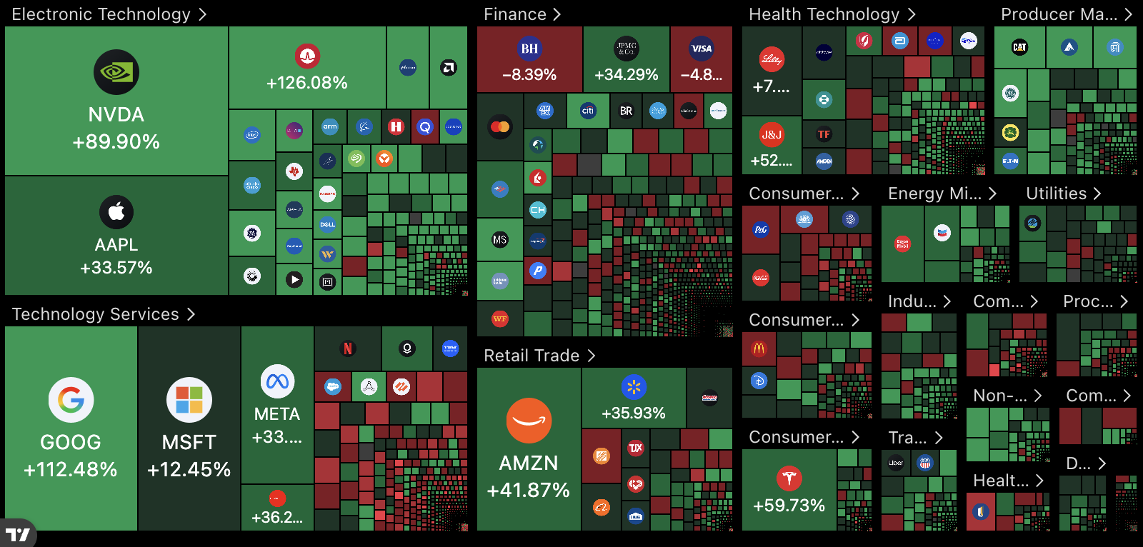
US Stock Market Sectors
These charts display the relative strength for each US stock market sector. The relative strength indicates how well a given sector performed compared to the overall stock market (as measured by the S&P 500).
Fama & French 5-Factor Model
This chart compares the cumulative performance and monthly returns of the US Fama-French five-factor portfolios, showing how market, size, value, profitability, and investment factors have evolved over time.
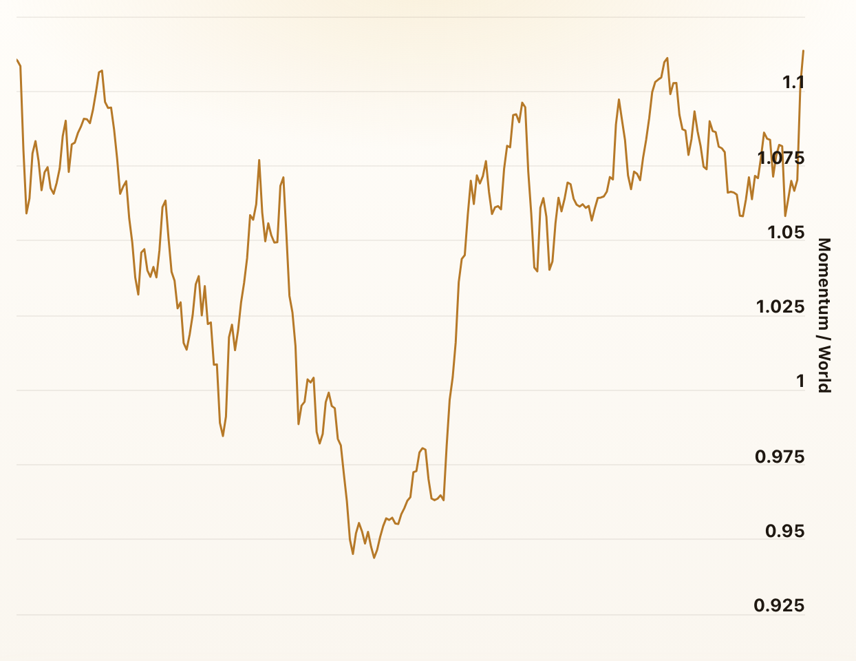
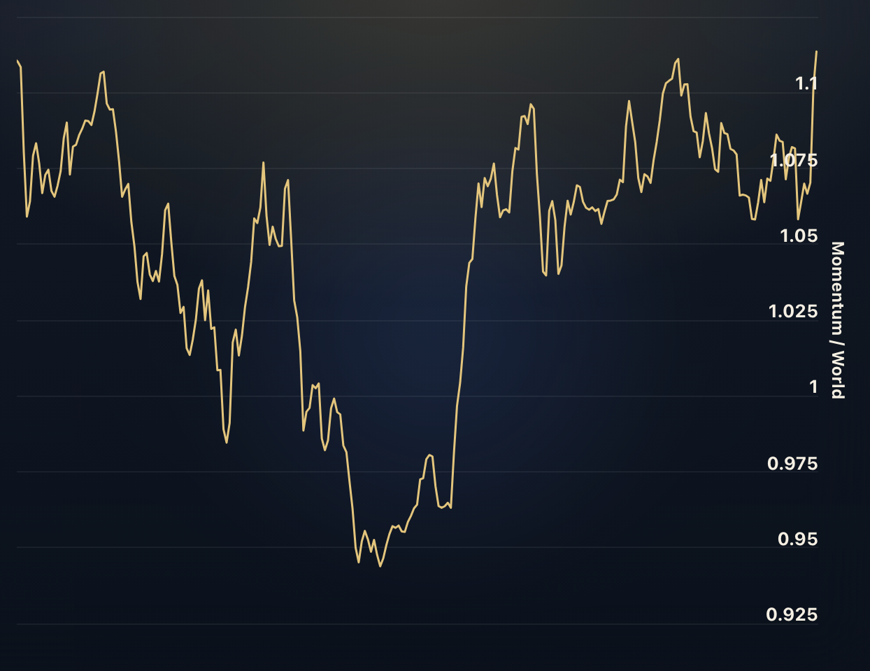
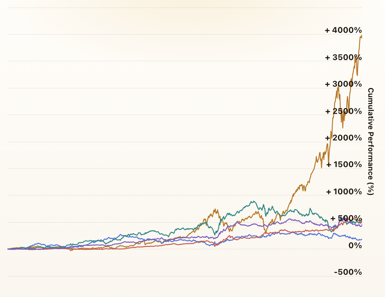
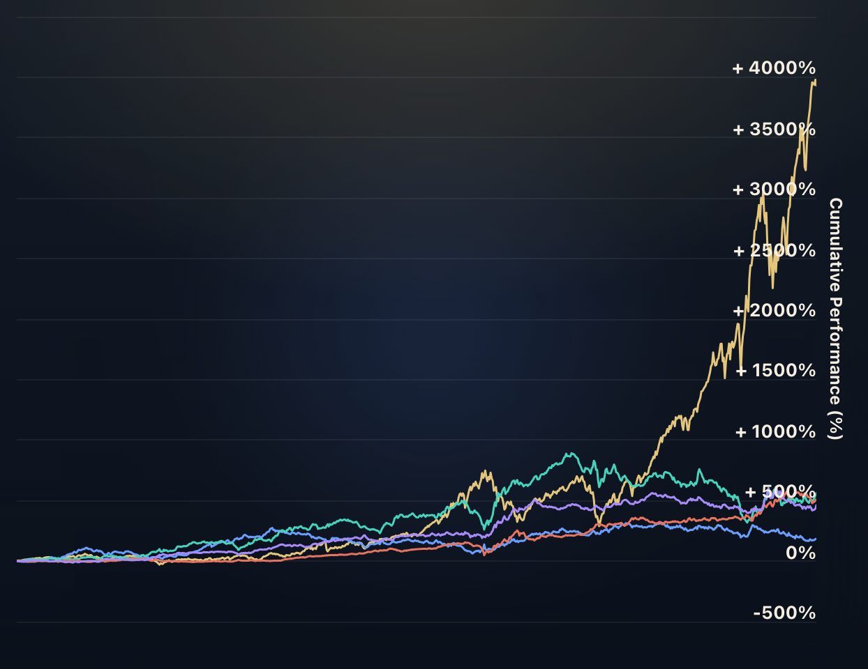
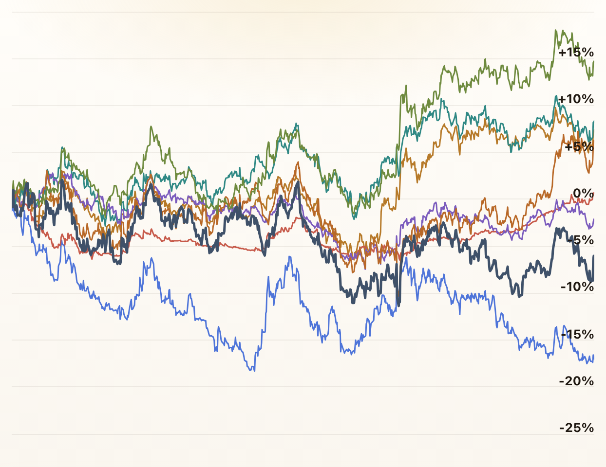
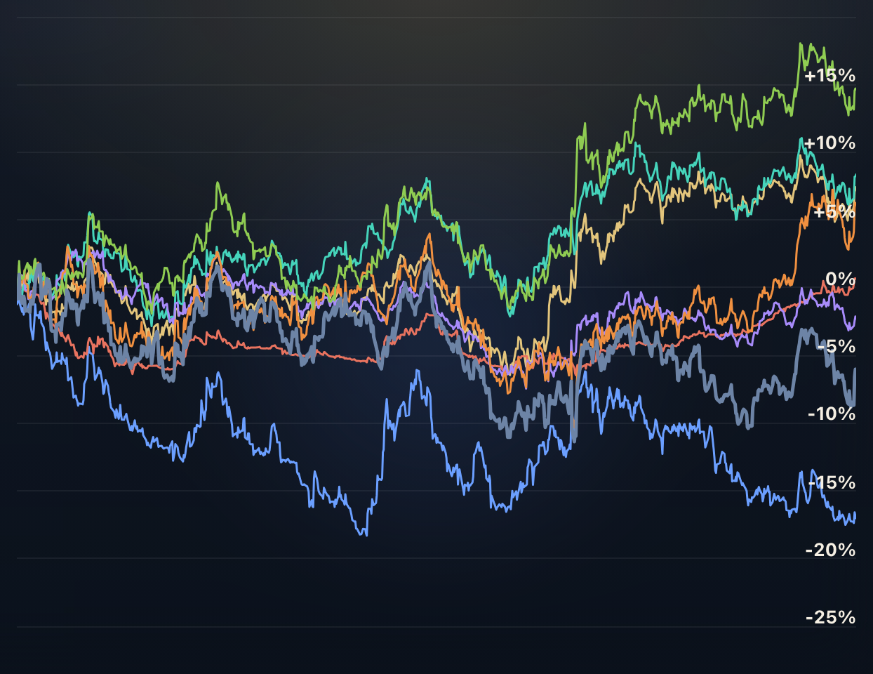
Factor Investing
These charts show the relative strength and correlation of MSCI World Factor Indices, such as Momentum, Growth, Value, Quality, Small Cap, and Minimum Volatility.
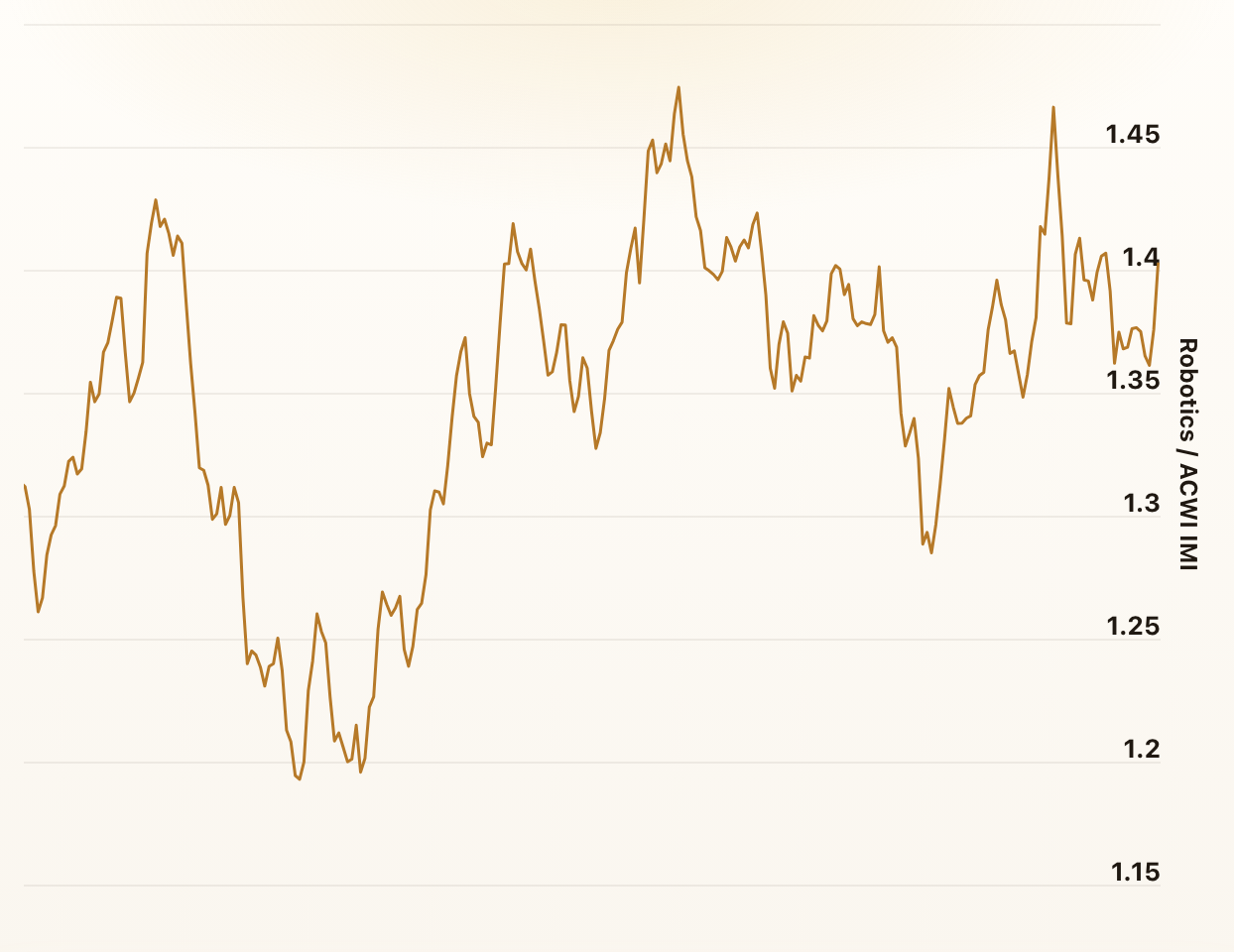
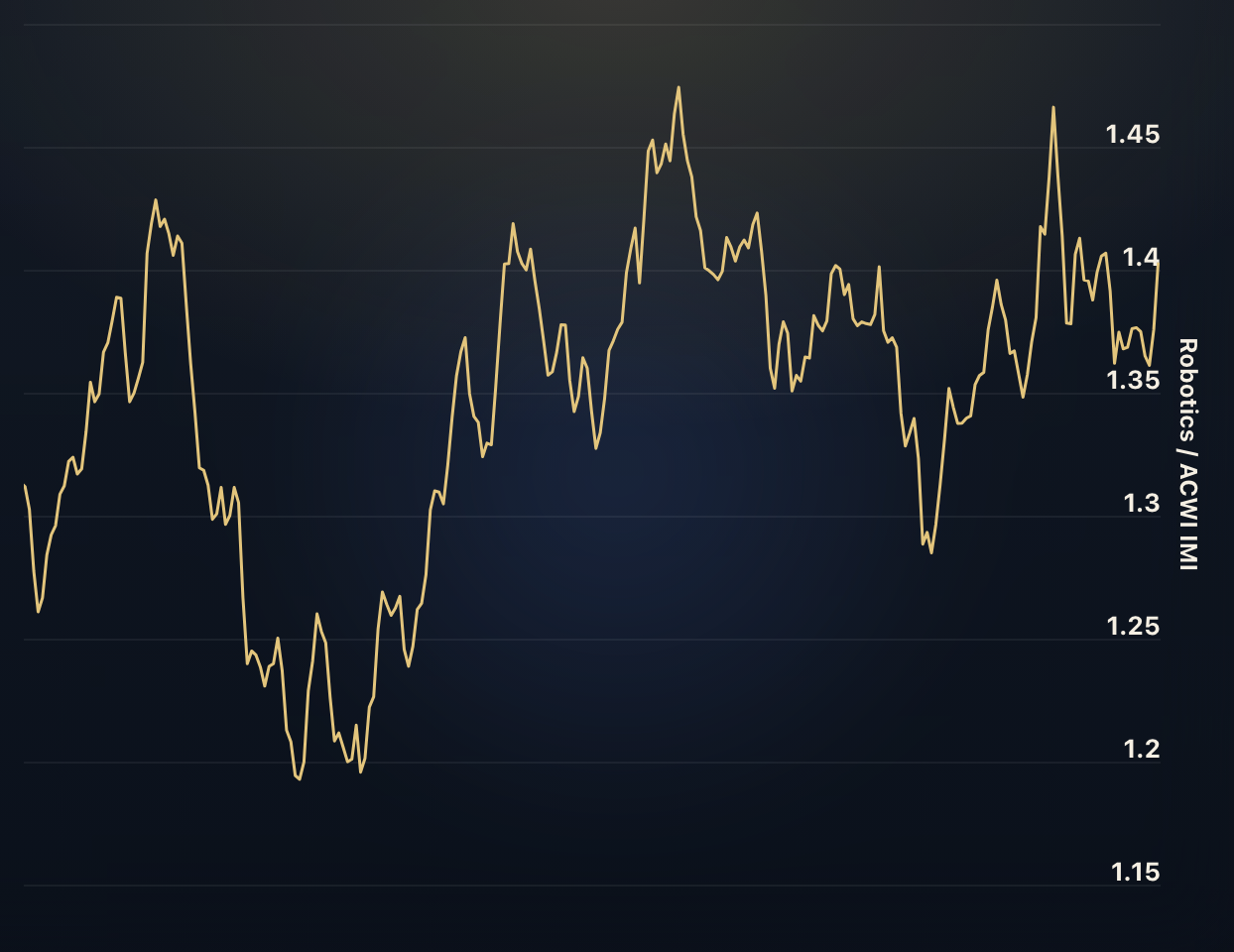
Thematic Investing: Megatrends
These charts show the relative strength and correlation of MSCI Thematic Investing Indices, covering areas such as Transformative Technologies, Environment & Resources, Health & Healthcare, and Society & Lifestyle.
Foreign Exchange Rates
These charts show the exchange rates of various currencies against the US Dollar (USD) as well as how they are correlated.
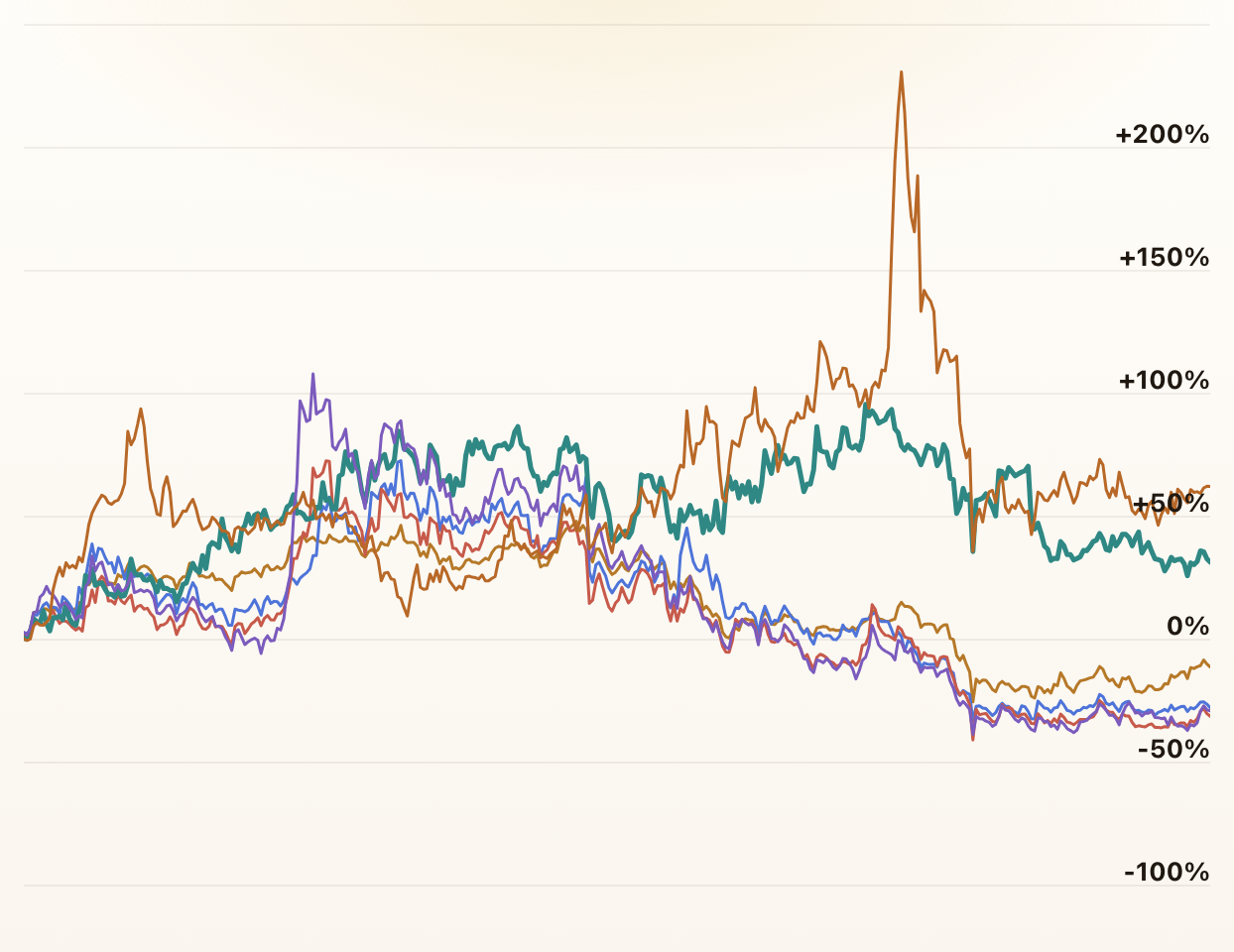
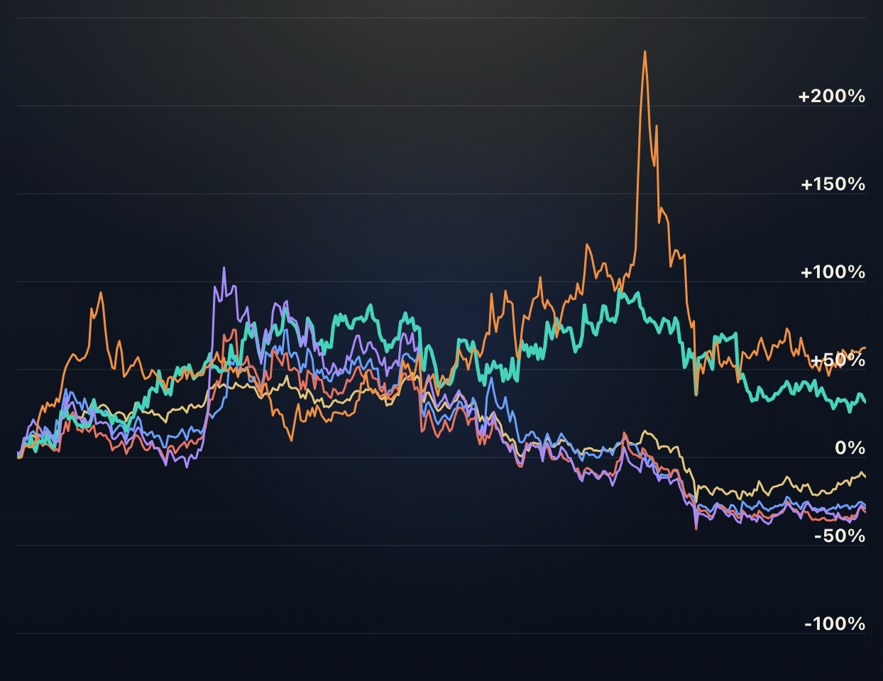
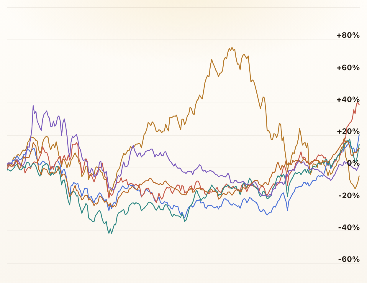
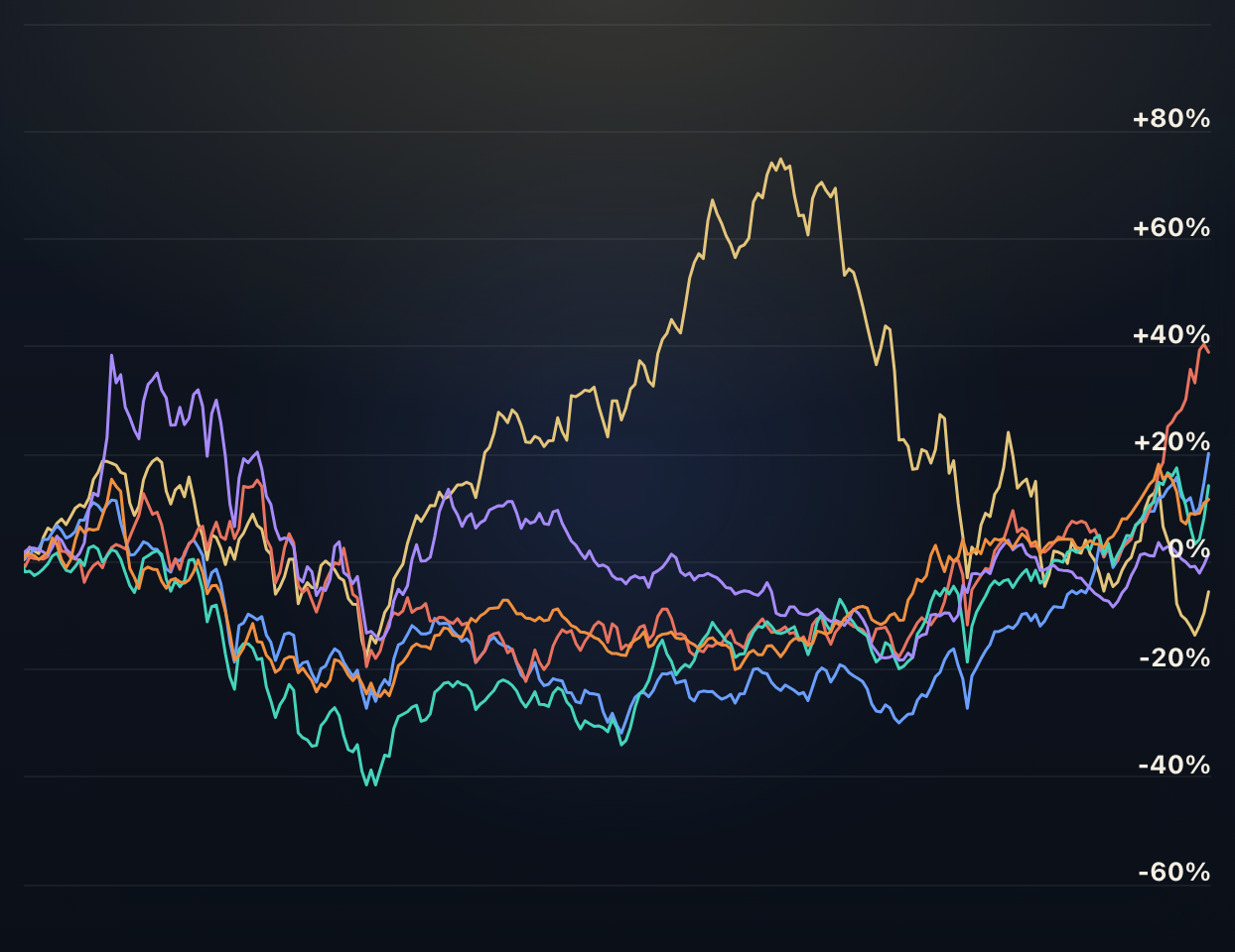
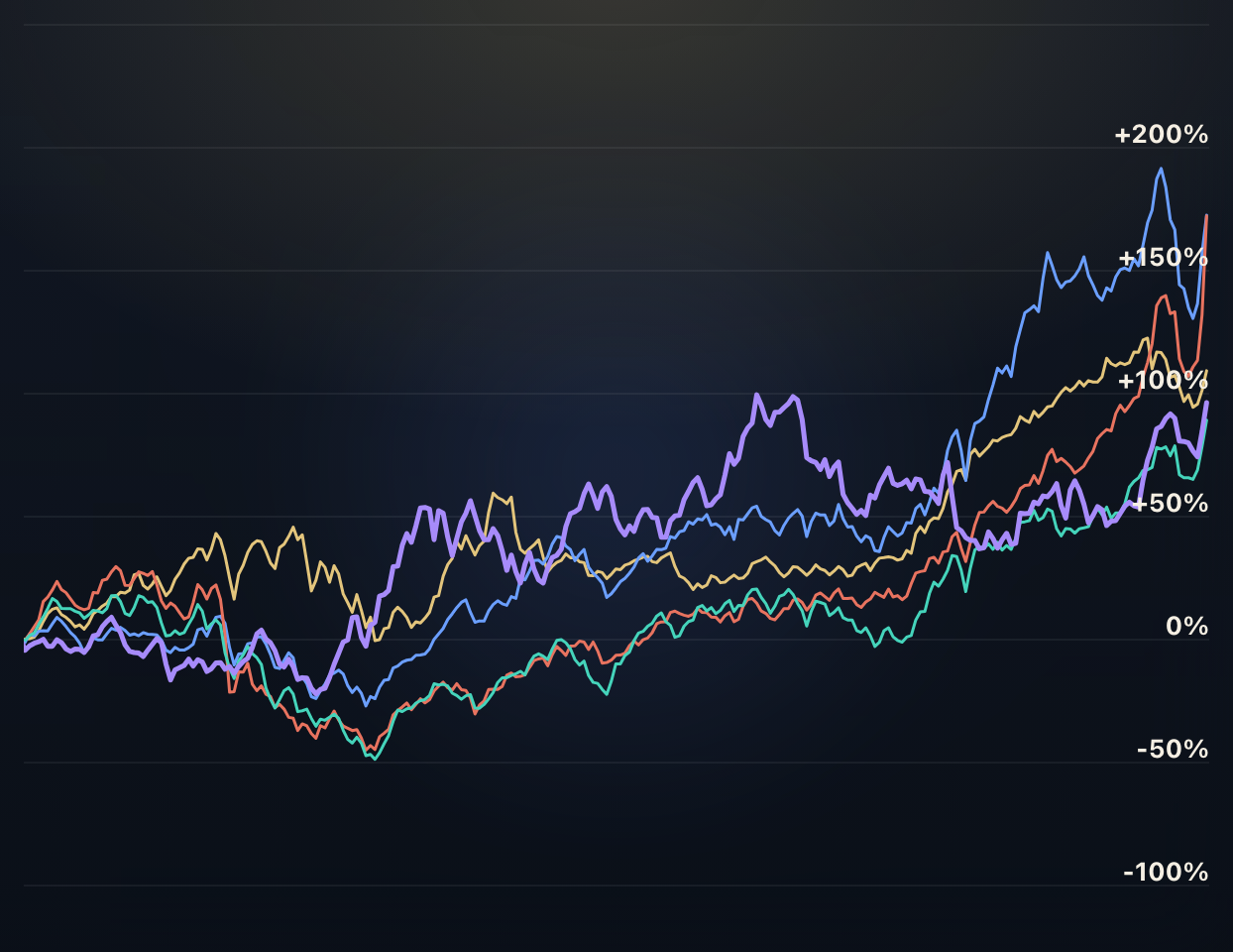
Cryptocurrencies
These charts compare the performance of the top cryptocurrencies. They also offer insights into the correlation between the tokens.
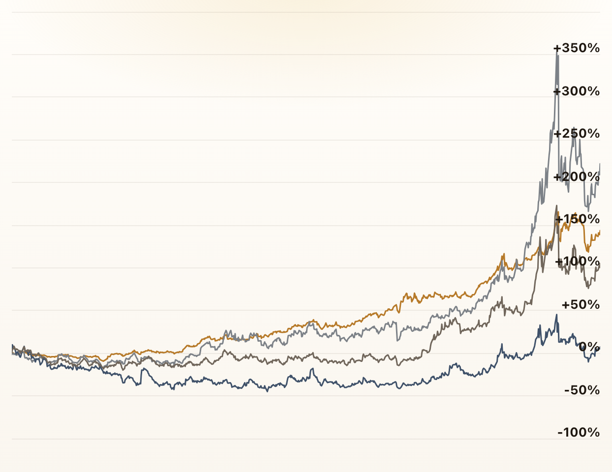
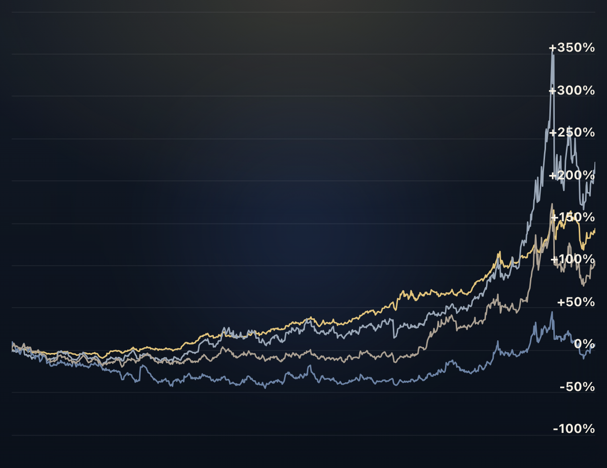
Commodity Futures
These charts compare the performance of different commodity futures contracts and offer insights into the correlations among them.
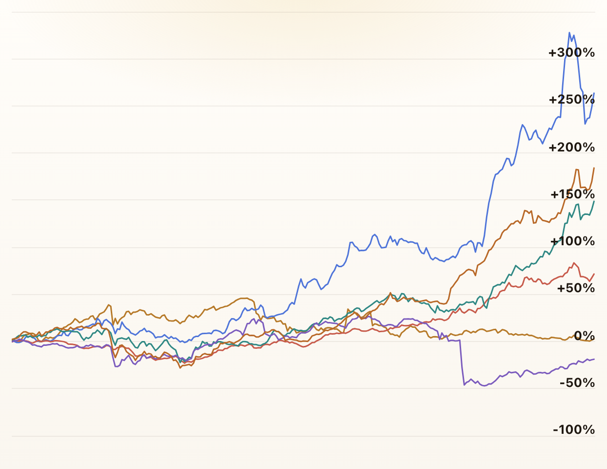
MSCI Country Indices
These charts compare the performance of all MSCI Country Indices from Developed, Emerging, and Frontier Markets. They also offer insights into the correlation between the indices.
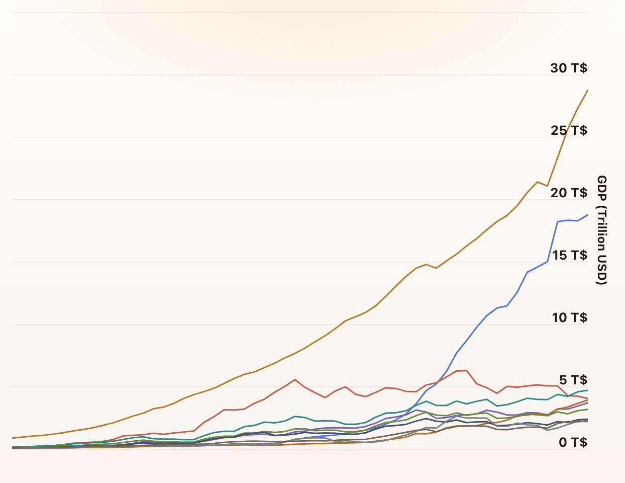
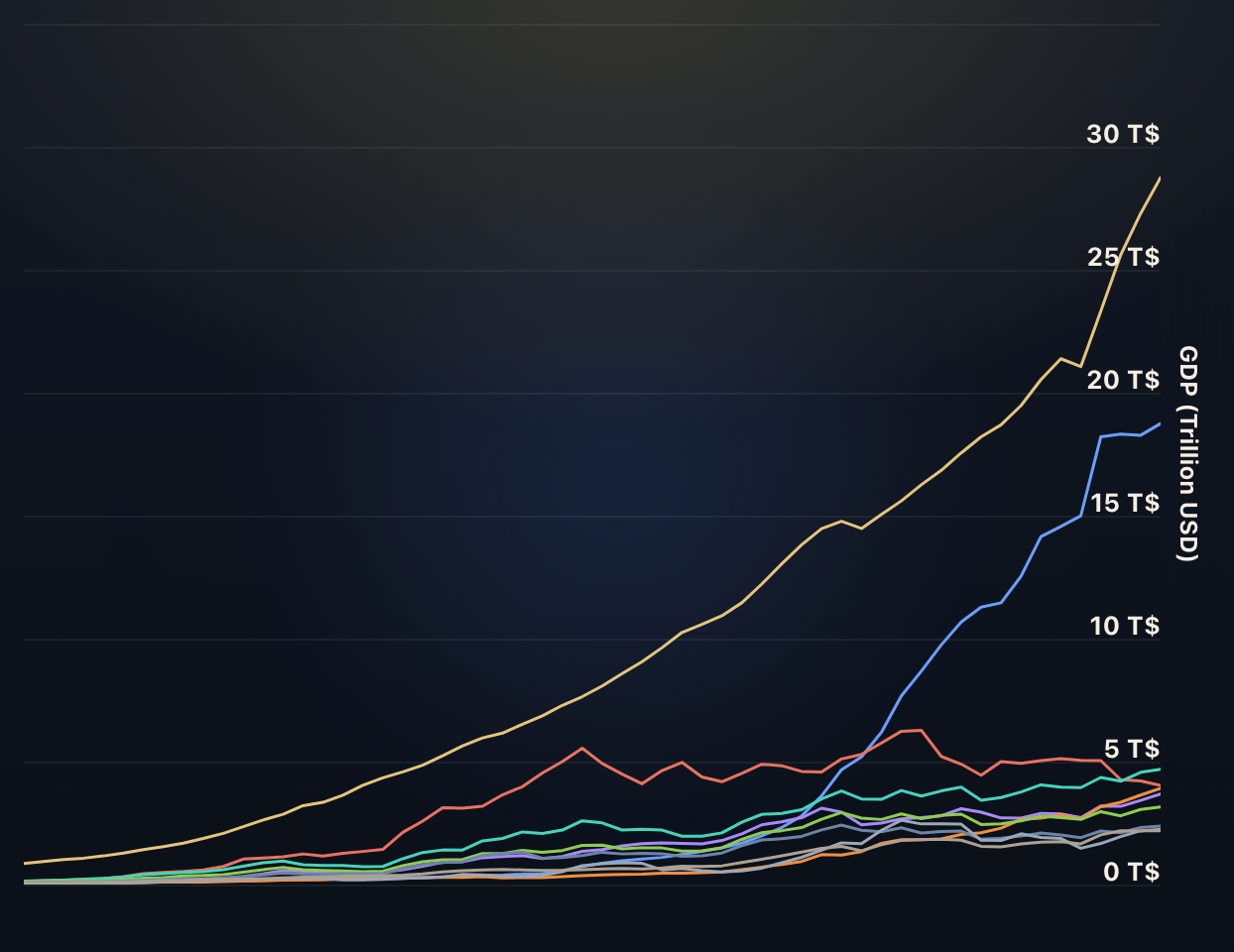
Worldwide GDP Comparison
These charts displays the Gross Domestic Product (GDP) for various countries over time. A country's GDP represents the final market value of all the products and services that a country produces in a single year.
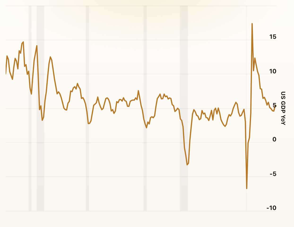
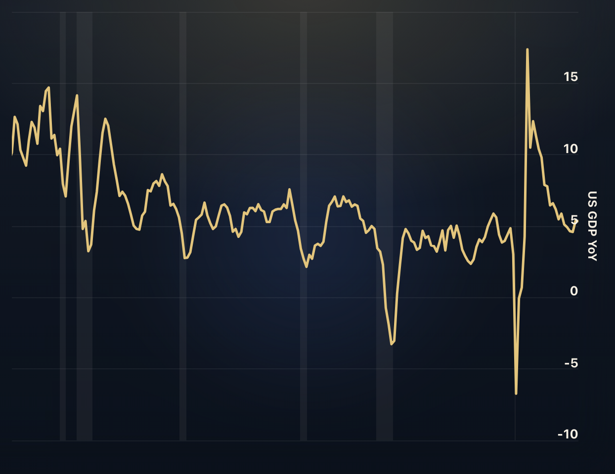
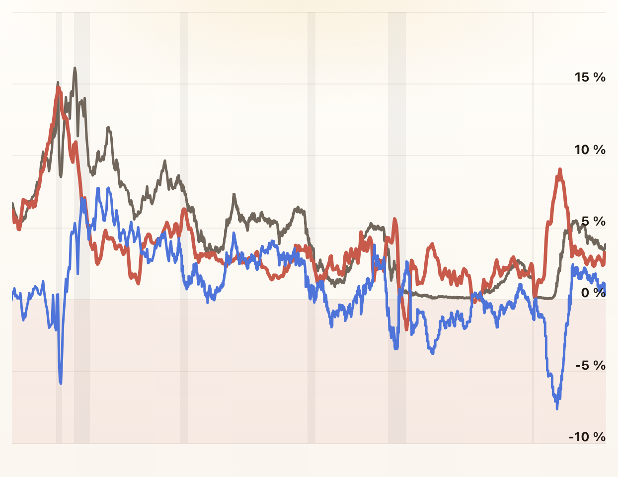
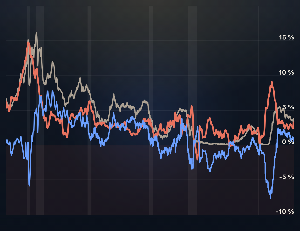
The Business Cycle
The business cycle illustrates economic fluctuations over time. This page features charts visualizing the cyclical patterns of rising and falling economic activity.
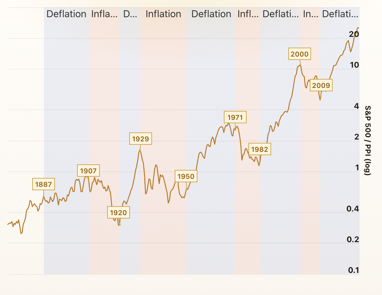
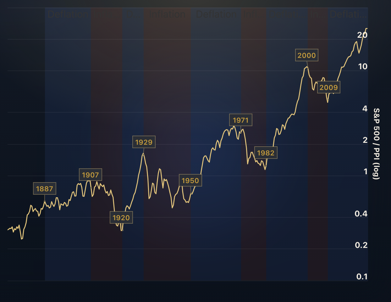
Stocks to Commodities Ratio
The stocks to commodities ratio measures the S&P 500 relative to the commodity market index PPI (Producer Price Index).
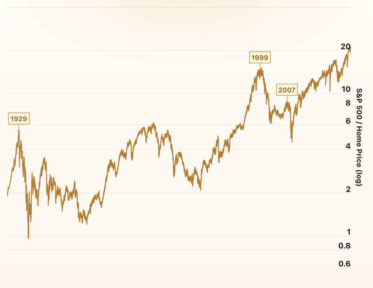
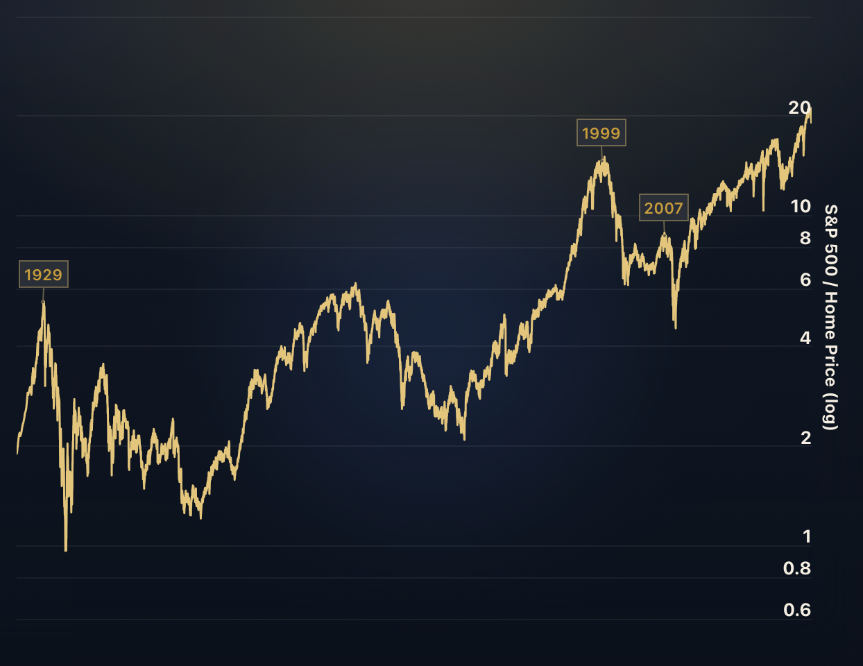
Stocks vs. Real Estate
The Stocks to Real Estate ratio divides the S&P 500 index by the Case-Shiller Home Price Index. Just like Market Cap to GDP, it has an interesting historical track record and clearly shows the stock market bubbles of 1929 and 1999.
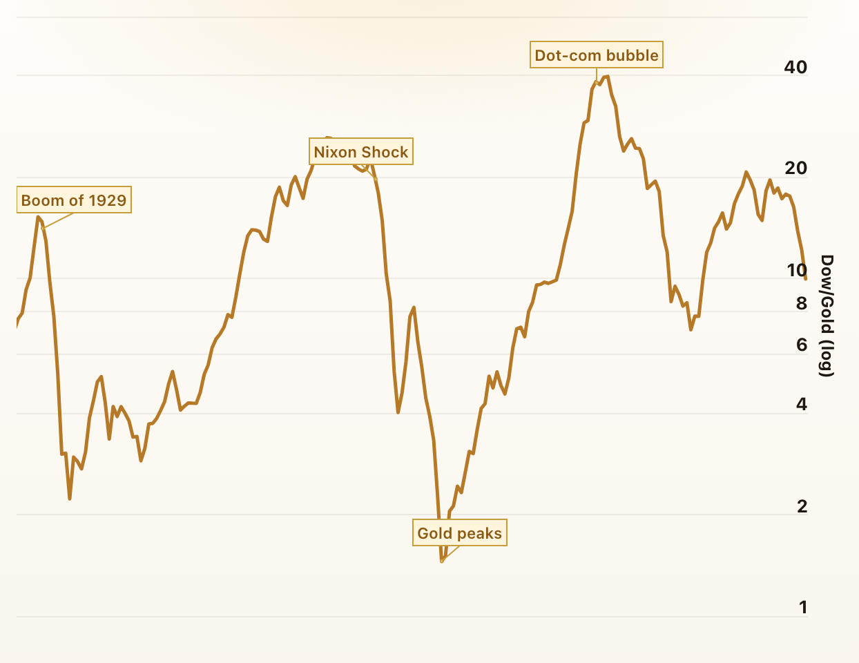
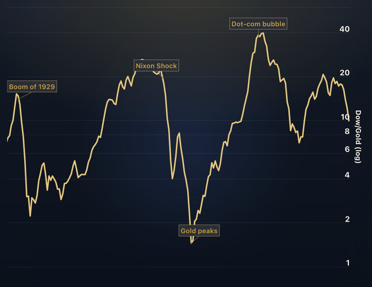
Dow to Gold Ratio
The Dow to Gold ratio provides insight into the relative performance of stocks compared to gold.
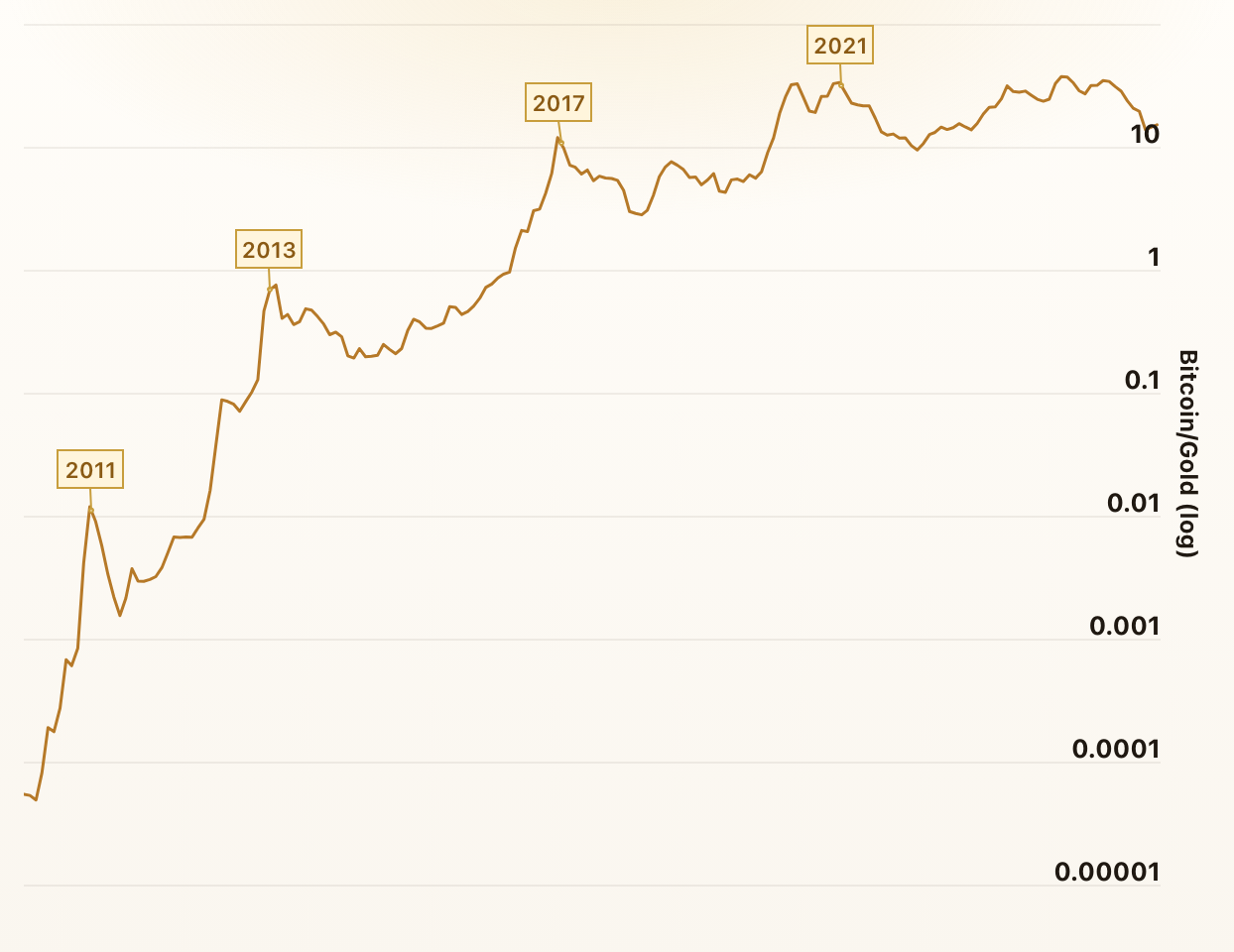
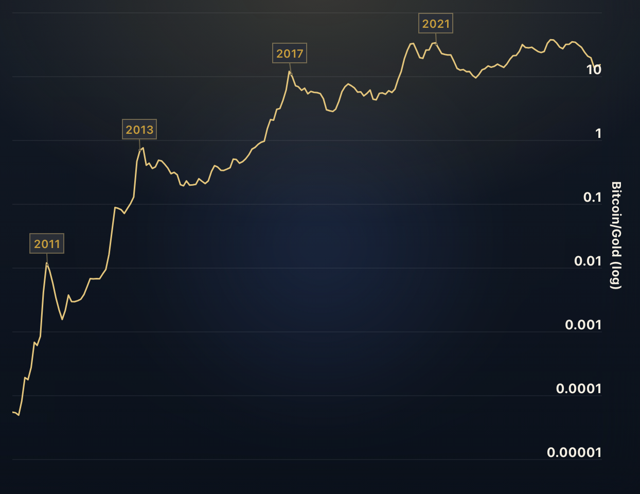
Bitcoin vs. Gold
The ratio in this chart divides the price of Bitcoin by the price of Gold. When the ratio rises, Bitcoin is outperforming Gold - and when it falls, Gold is outperforming Bitcoin.
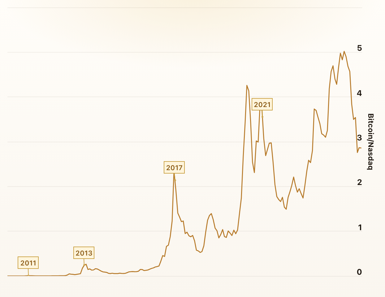
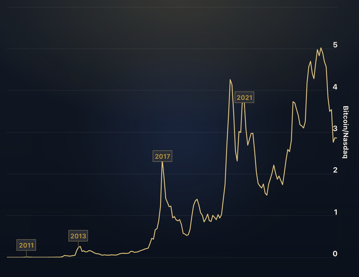
Bitcoin vs. Nasdaq 100
The ratio in this chart divides the price of Bitcoin by the Nasdaq 100 index. When the ratio rises, Bitcoin is outperforming the Nasdaq 100 - and when it falls, the Nasdaq 100 is outperforming Bitcoin.

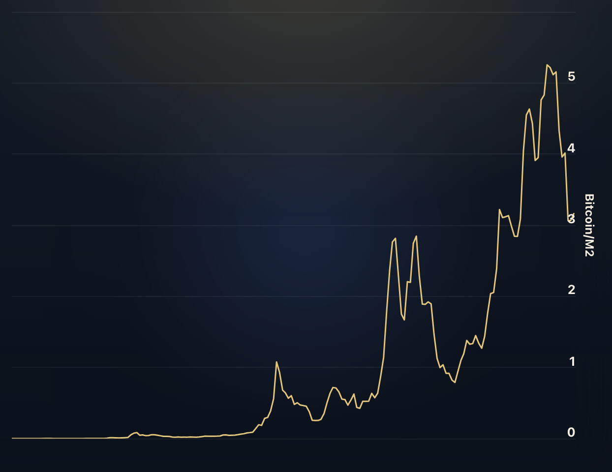
Bitcoin vs. M2 Money Supply
The ratio in this chart divides the price of Bitcoin by the US M2 Money Supply. When the ratio rises, Bitcoin is outpacing the growth of the money supply - and when it falls, the money supply is growing faster than Bitcoin.
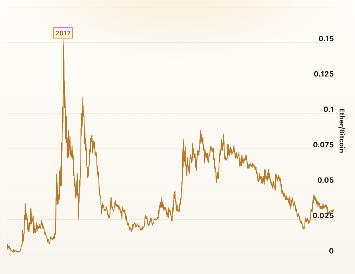
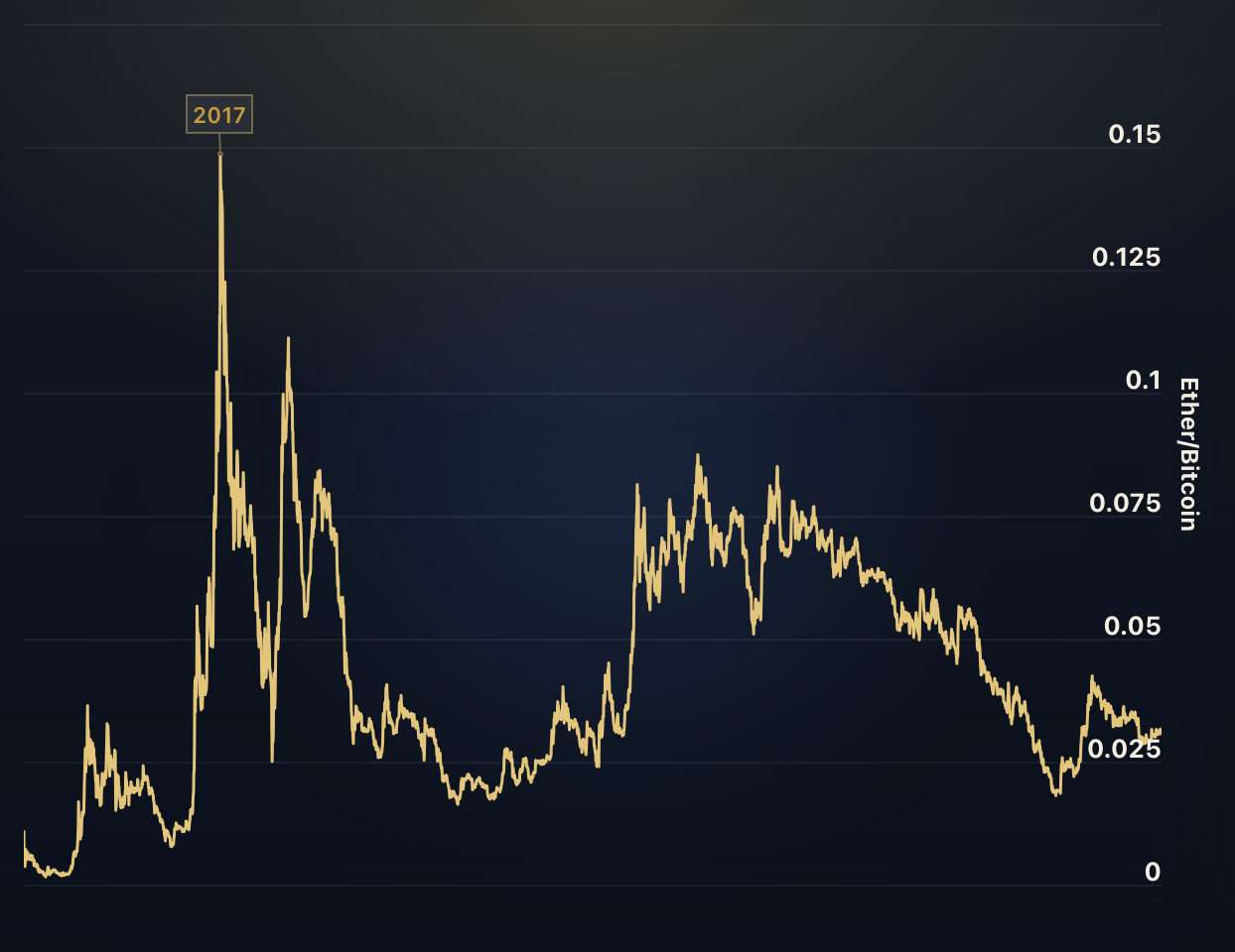
Ethereum vs. Bitcoin
The ratio in the chart above divides the price of Ether by the price of Bitcoin. When the ratio rises, Ether is outperforming Bitcoin - and when it falls, Ether is underperforming.
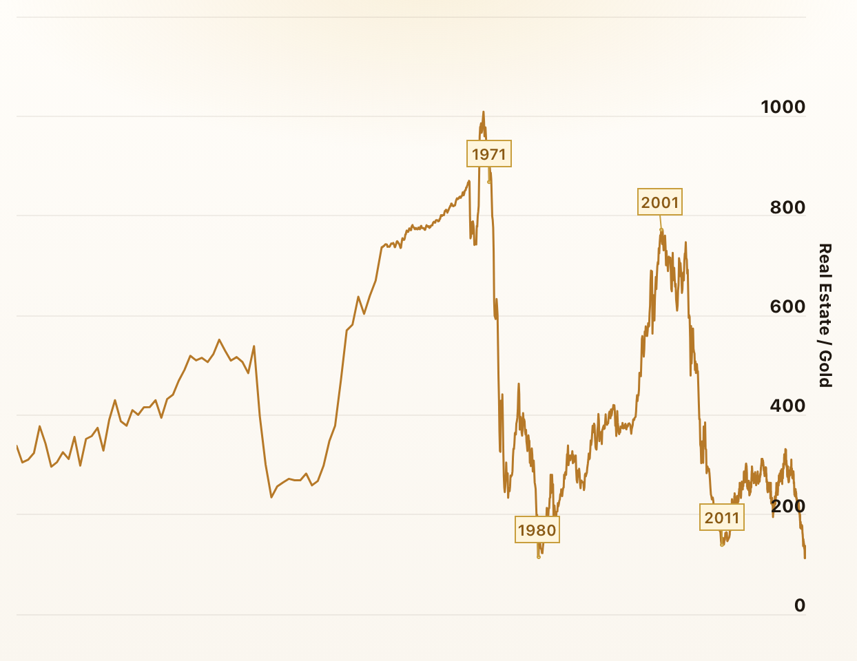
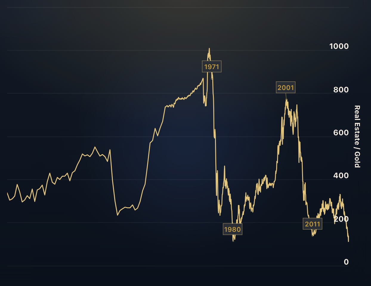
Real Estate to Gold Ratio
The real estate to gold ratio is a measure of relative value between gold and real estate. It indicates the number of ounces of gold required to purchase an average single family house in the United States.
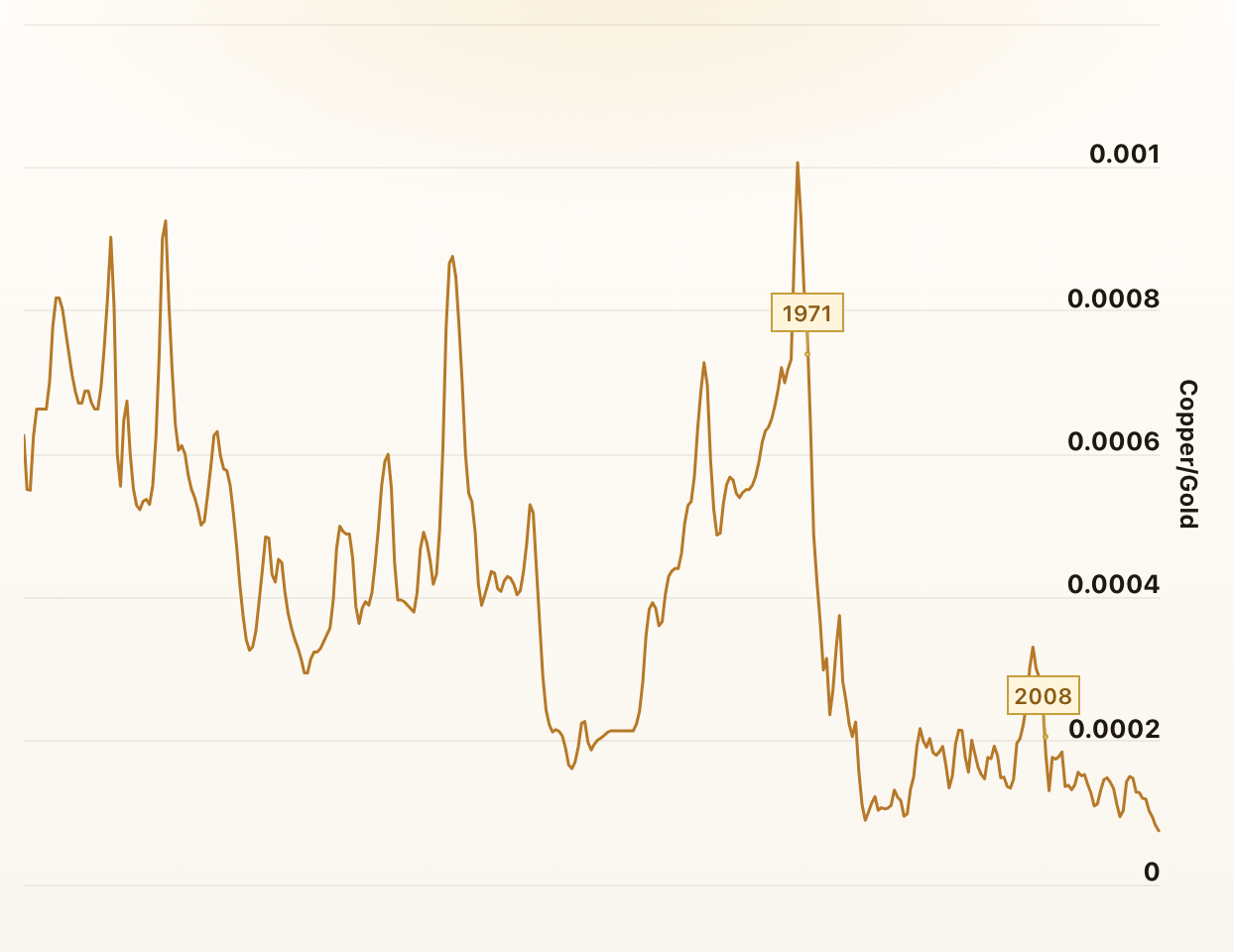
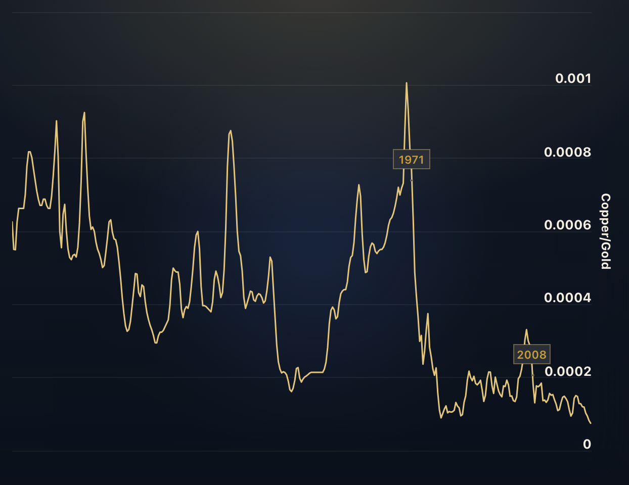
Copper to Gold Ratio
The copper to gold ratio indicates the number of ounces of gold it takes to buy an ounce of copper. The ratio is an indicator of the health of the global economy and interestingly, it correlates strongly with interest rates.
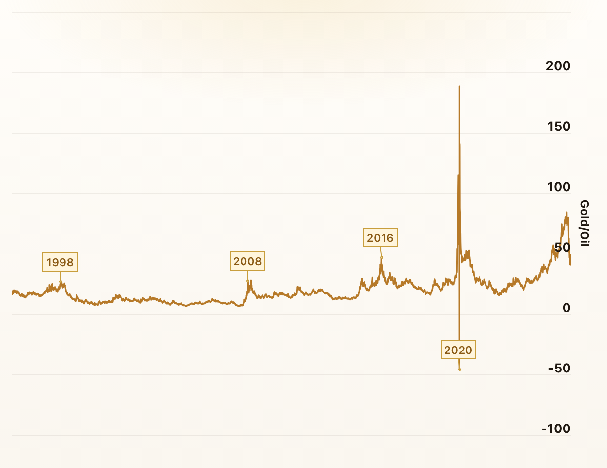
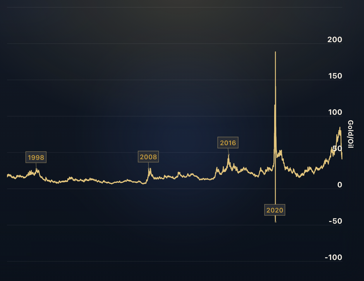
Gold to Oil Ratio
The gold-to-oil ratio serves as a valuable metric in understanding the relationship between gold and oil prices and can provide insights into potential economic crises and stock market volatility.
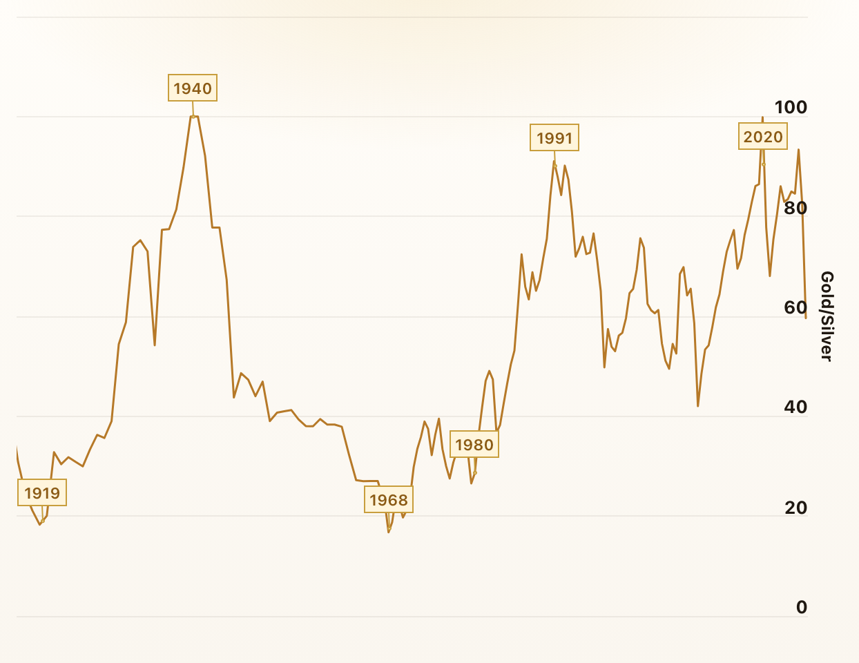
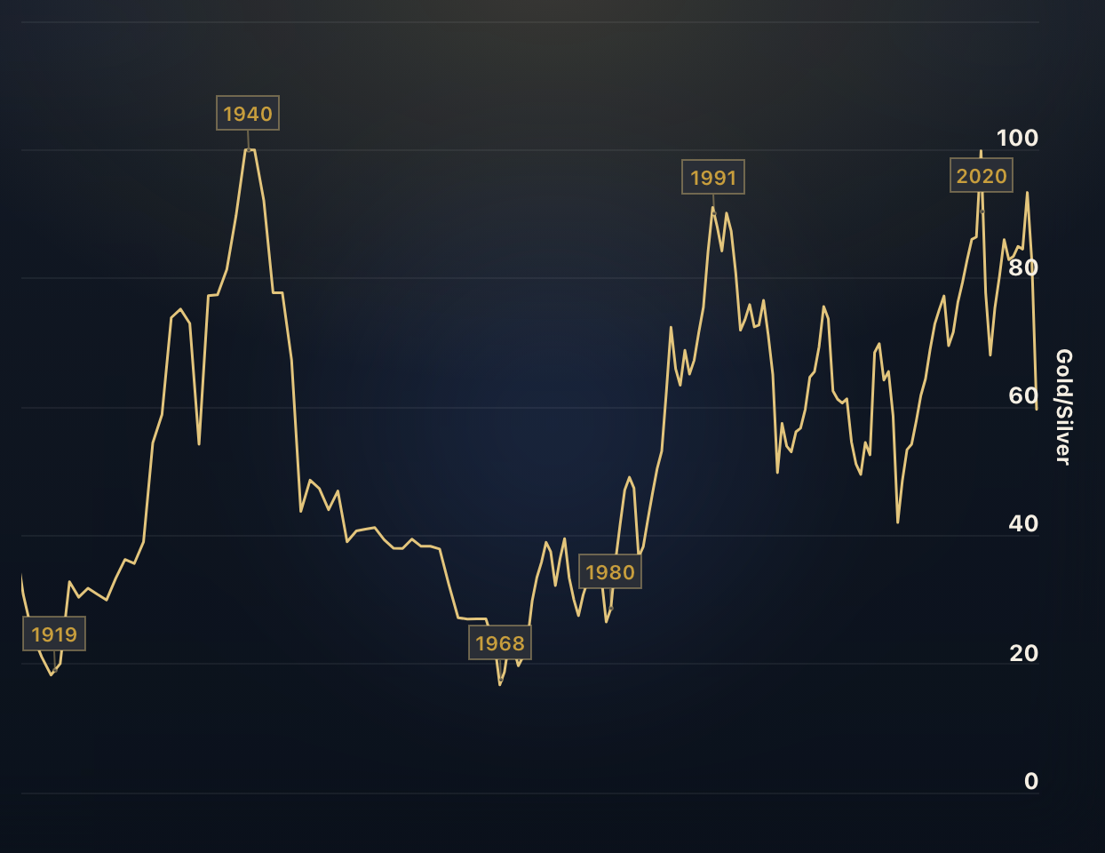
Gold to Silver Ratio
The gold silver ratio represents the number of silver ounces it takes to buy a single ounce of gold. Interestingly, it correlates strongly with the US Dollar index.
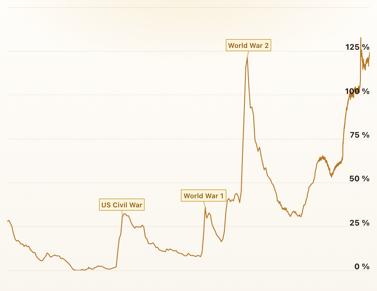
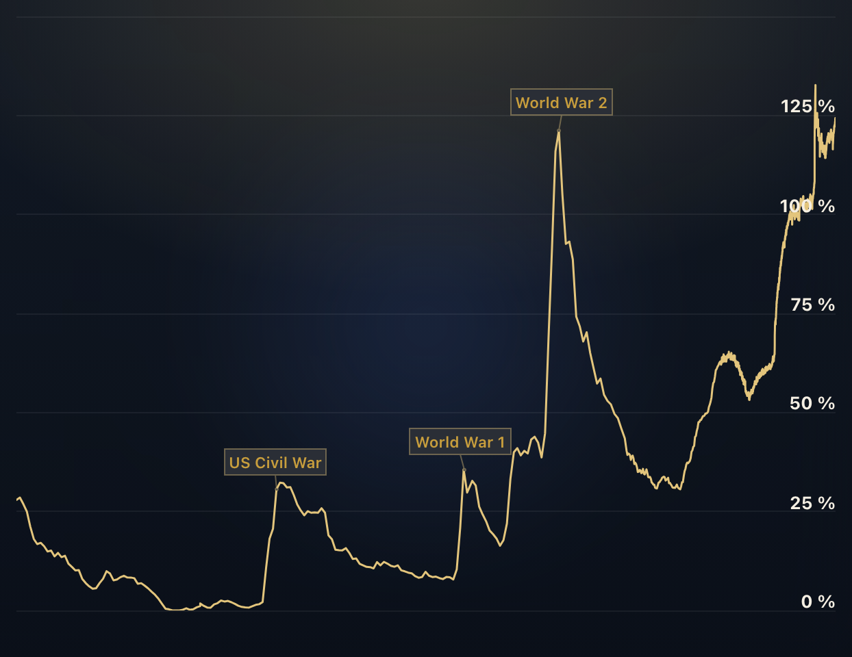
US Debt to GDP
These charts show the government-, corporate-, and household-debt to gdp ratios. Expressing a nation's debt as a ratio to its gross domestic product (GDP) allows for better comparison over time.
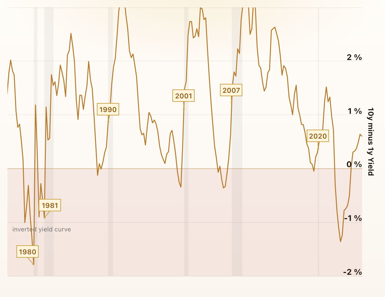
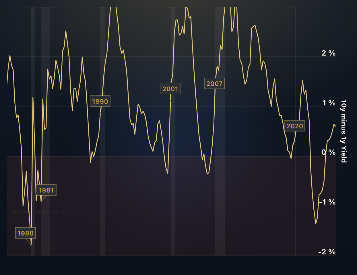
US Yield Curve
These charts display the spreads between long-term and short-term US Government Bond Yields. A negative spread indicates an inverted yield curve, which is often considered to be a predictor of an economic recession.
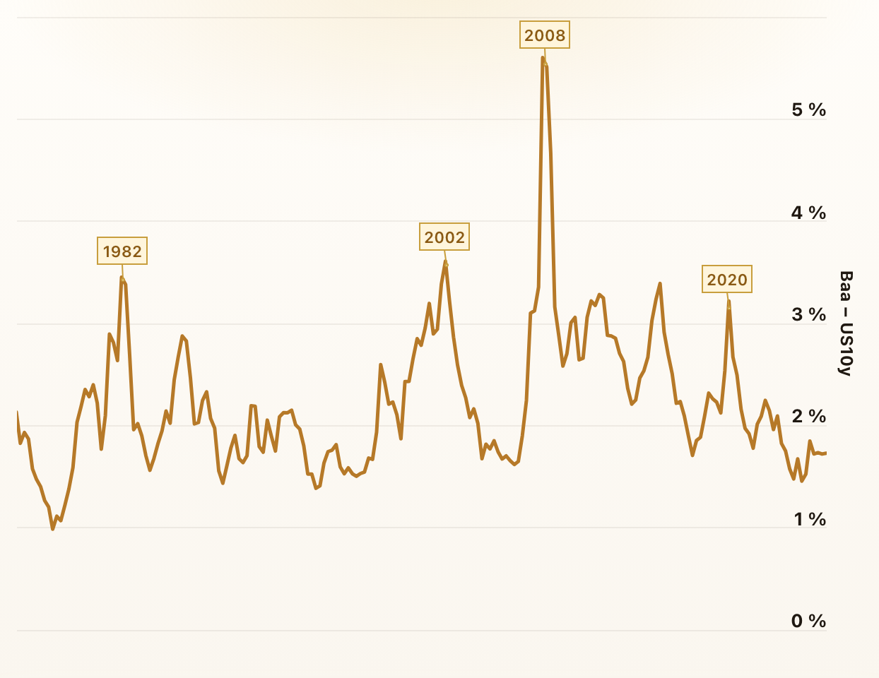
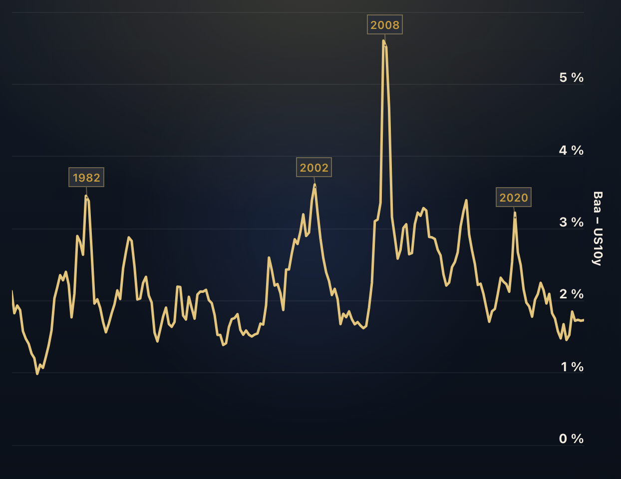
Bond Yield Credit Spreads
These charts display the yield spreads between Corporate Bonds, Treasury Bonds, and Mortgages. The spreads tend to widen in economic recessions and indicate an increased risk of default as well as reduced liquidity in the market.
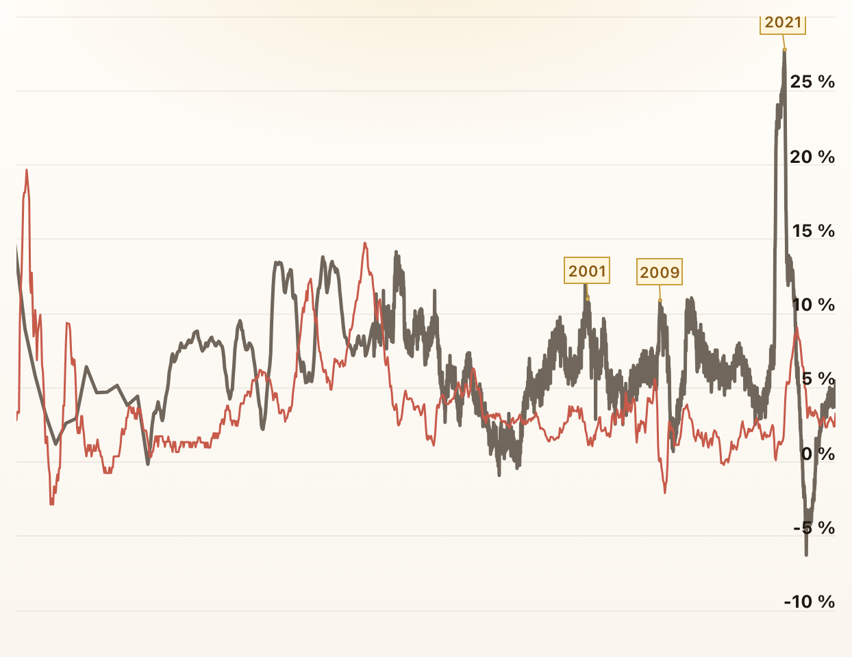
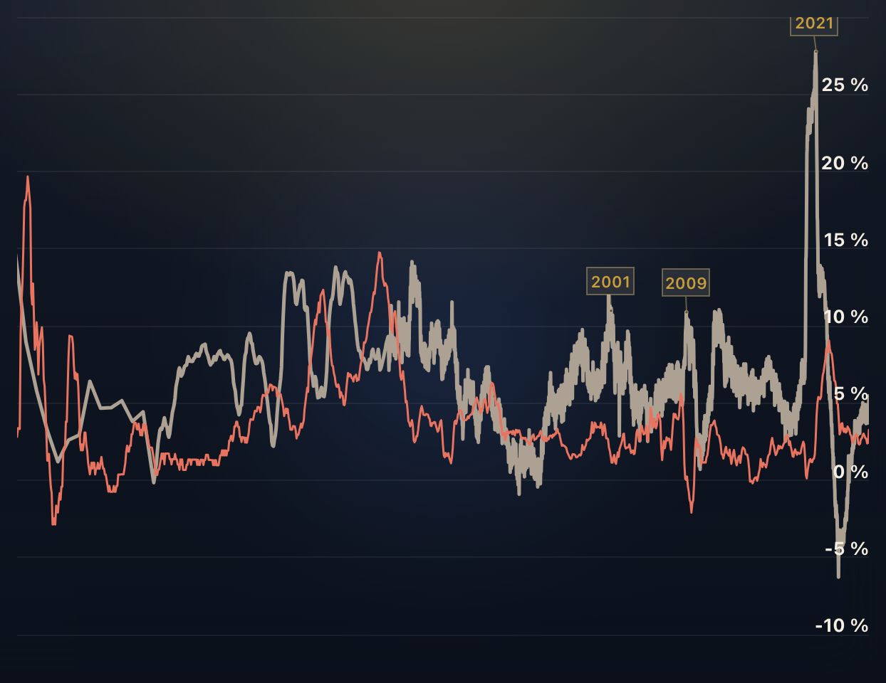
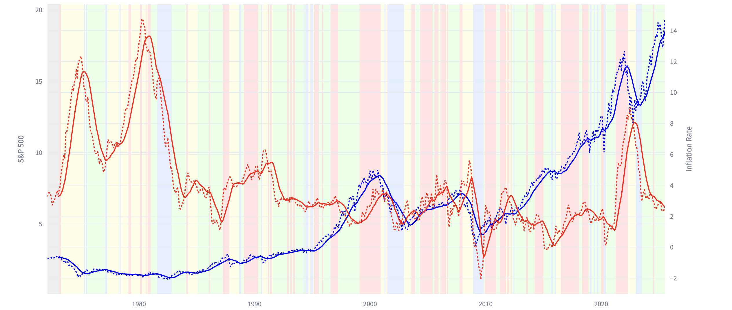
M2 Money Supply Growth vs. Inflation
The M2 Money Supply is a measure for the amount of currency in circulation. This chart plots the yearly M2 Growth Rate and the Inflation Rate.
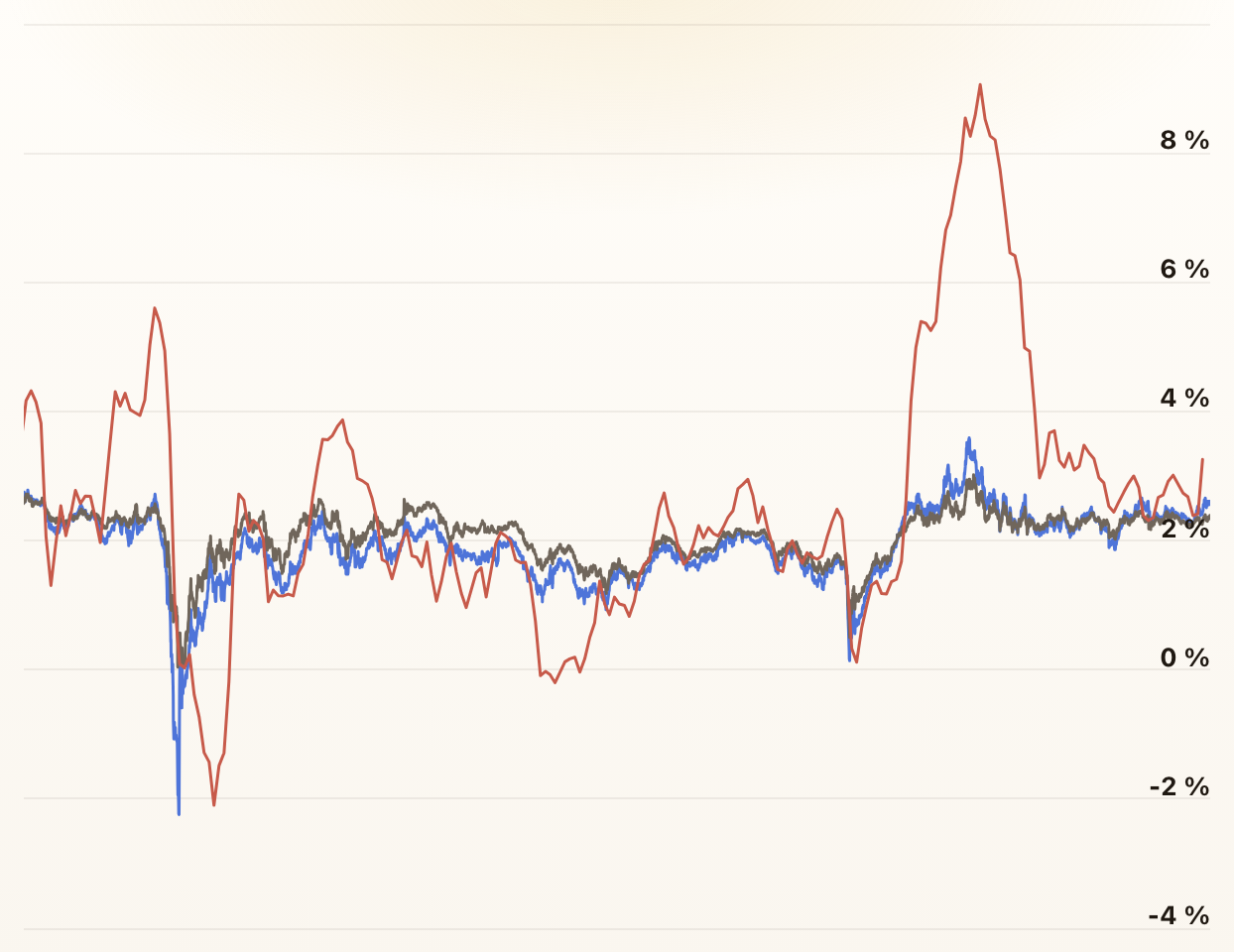
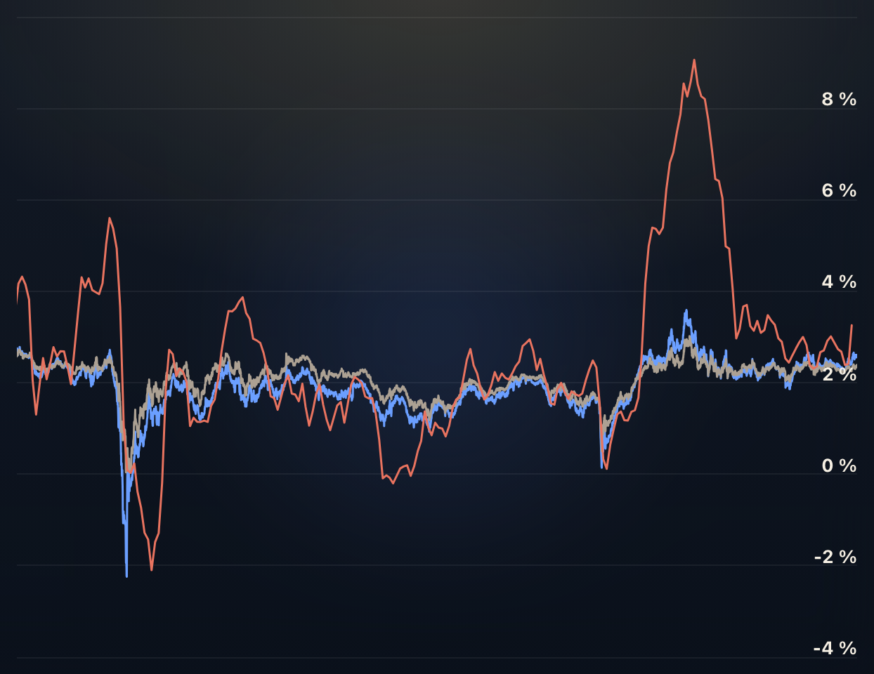
Breaking Down US Inflation
This page breaks down US inflation trends, comparing actual inflation with market expectations and dissecting the Consumer Price Index into its major components.
The Real Interest Rate
The real interest rate is calculated as the difference between the nominal interest rate and the inflation rate.
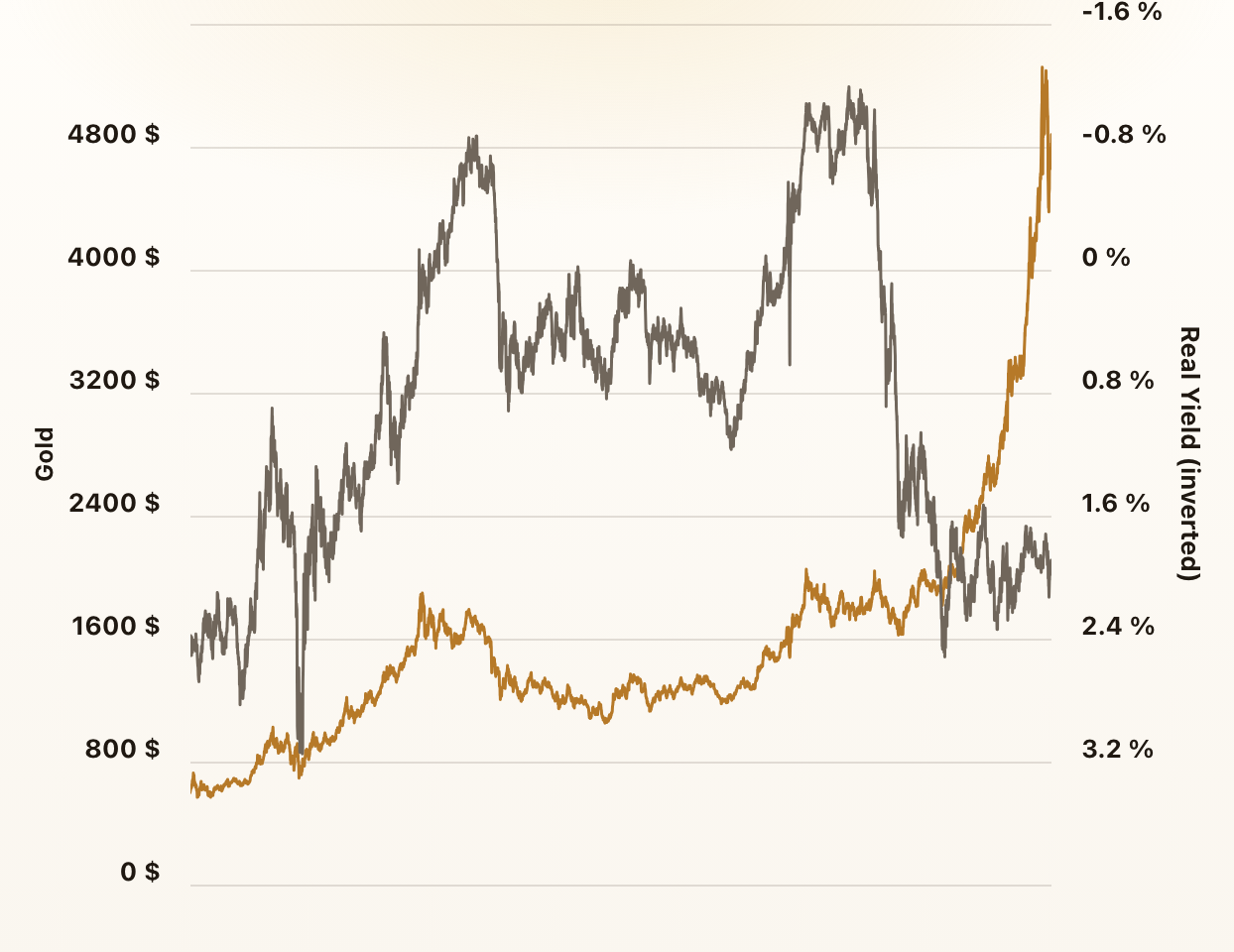
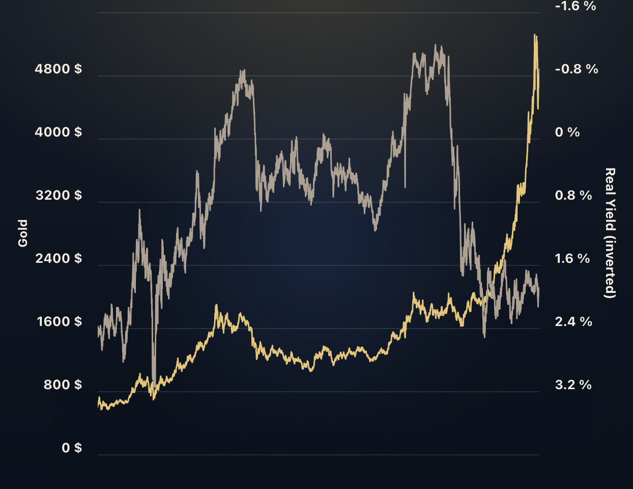
Gold vs. Real Yields
This chart plots gold prices and real yields. Gold and real yields are negatively correlated. In other words, when real yields go down gold goes up.
Mining Stocks vs. Gold & Silver
How do mining companies perform compared to the physical metals that they produce? This chart goes back all the way back to 1939.
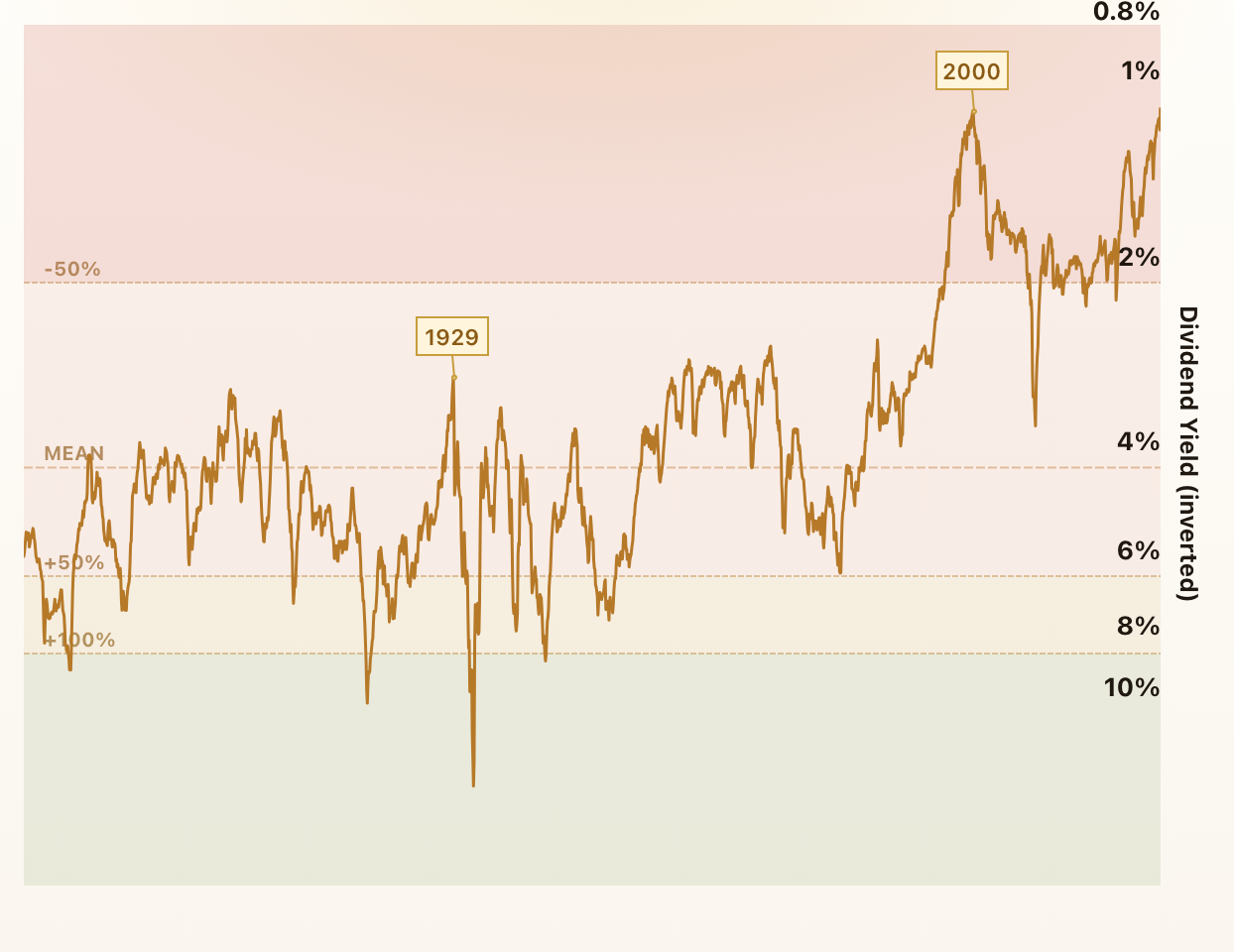
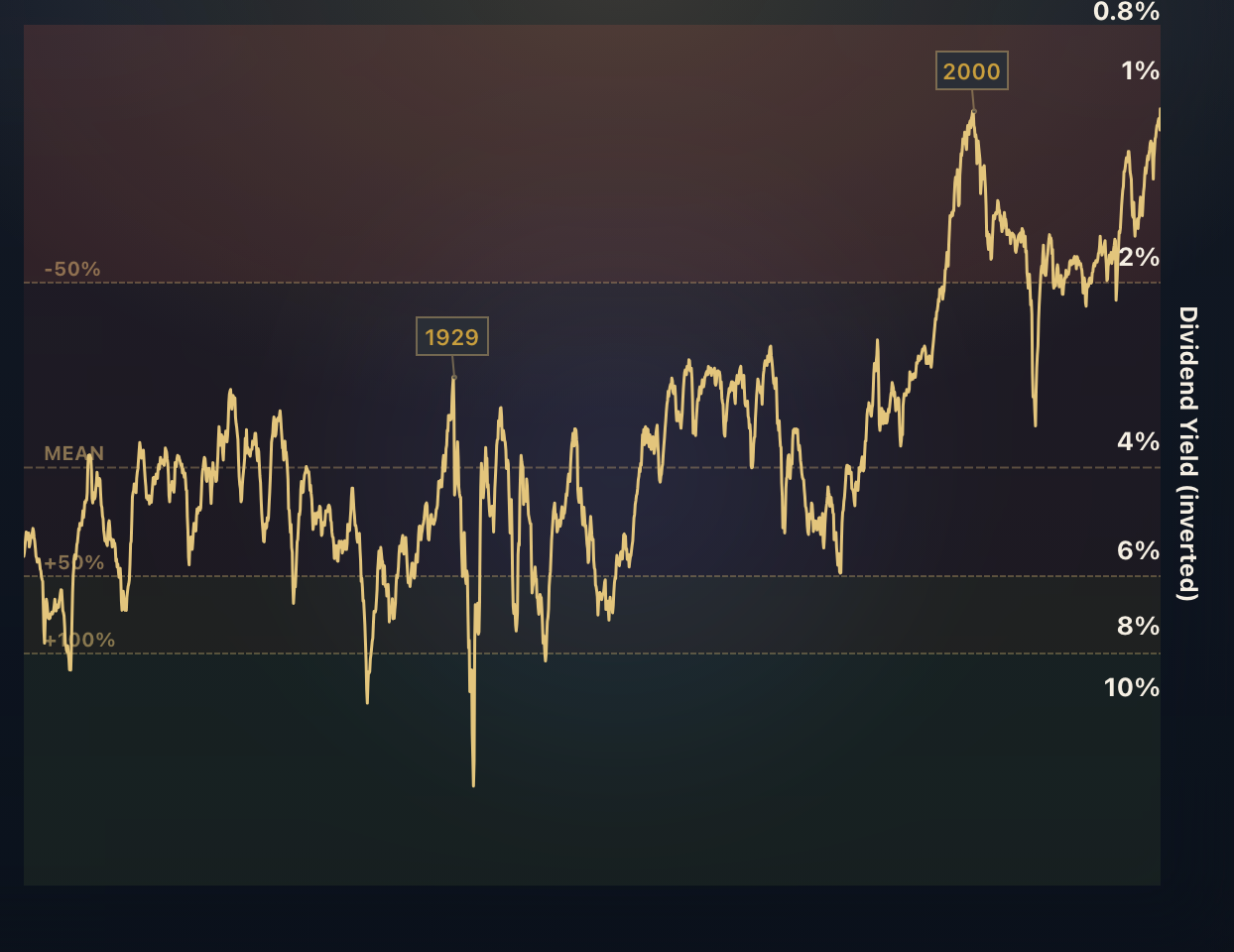
S&P 500 Dividend Yield
The dividend yield indicates how much a company pays out in dividends each year relative to its share price. In other words, it measures how much "bang for your buck" you are getting from dividends.
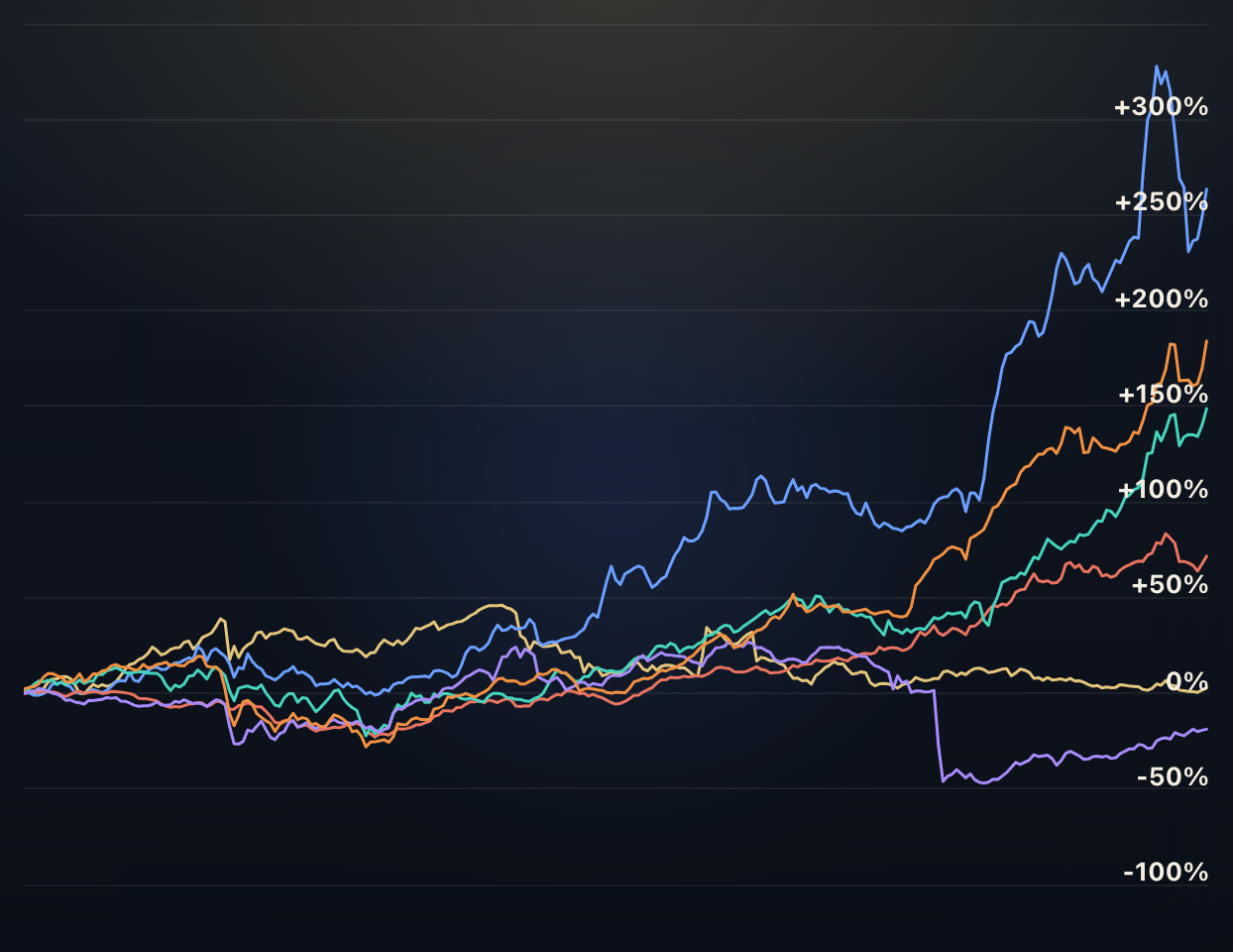
Developed Markets
These charts compare the performance of all 23 MSCI Developed Market Indices and offer insights into the correlation between the indices.
Emerging Markets
These charts compare the performance of all 24 MSCI Emerging Market Indices and offer insights into the correlation between the indices.
Frontier Markets
These charts compare the performance of all MSCI Frontier Market Indices and offer insights into the correlation between the indices.